


Like clothes, each font has a certain appearance and functional character to it that works better in different circumstances or situations. In the comparison of clothing Yves uses shoes; dancing shoes are shiny, but you wouldn’t use dancing shoes to climb a mountain (unless you have a death wish).
During the 70s and 80s Helvetica became very popular and was widely used by corporate America and according to Peters, unknowingly becoming the face of capitalism.
Black fonts were once a kind of fonts associated with right-wing extremism, but because of rap culture and gangsta-rappers’ extensive tattoo’s featuring black fonts has made a comeback as the face of urban and hip-hop music.
Every font has a certain instant visual connotation and the movie industry gladly embraces that fact. Peters takes us through a whole range of examples, displaying all matters of genres (big and red for comedy, serifed and elegant for romantic comedy) and the way the movie industry has set visual standards for their movie posters.
Inevitably that leads us to the use of Trajan. Interestingly enough Trajan seems to have a very broad ‘user-base’ as far as movies are concerned. It’s use is scattered over a whole range of various genres. Most interesting fact of the keynote was Peters’ extensive ‘research’ by that shows that Trajan is hardly a deal breaker as far as Oscars are concerned.
We see a decline in usage as Peters illustrates the number of movies per year that use Trajan in their movie posters, signifying ‘the fall of the Roman Empire’. But where one giant is in the process of falling another one rises to the top.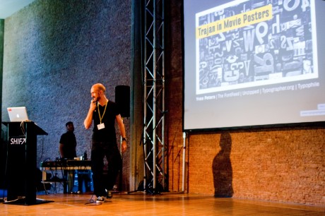
Quite possibly as an effect of Obama’s election campagne in 2008 we see a steady rise of the number of movies that use Hoefler-Frere jones’ font; Gotham (Obama’s campagne also utilized gotham). In 2011 two oscar winners used Gotham (Inception, The Fighter) and only one used Trajan (Black Swan).
So is there such a thing as an oscar-winning Font? Due to the visual nature of human beings it’s more likely that we characterize successful movies with a certain graphical pattern. The moment a new movie with the same pattern is released we automatically (subconsciously?) expect it to be successful.
Kind of kills the magic, doesn’t it?


