


Which work are you particularly proud of? Which work best represents your style or approach?
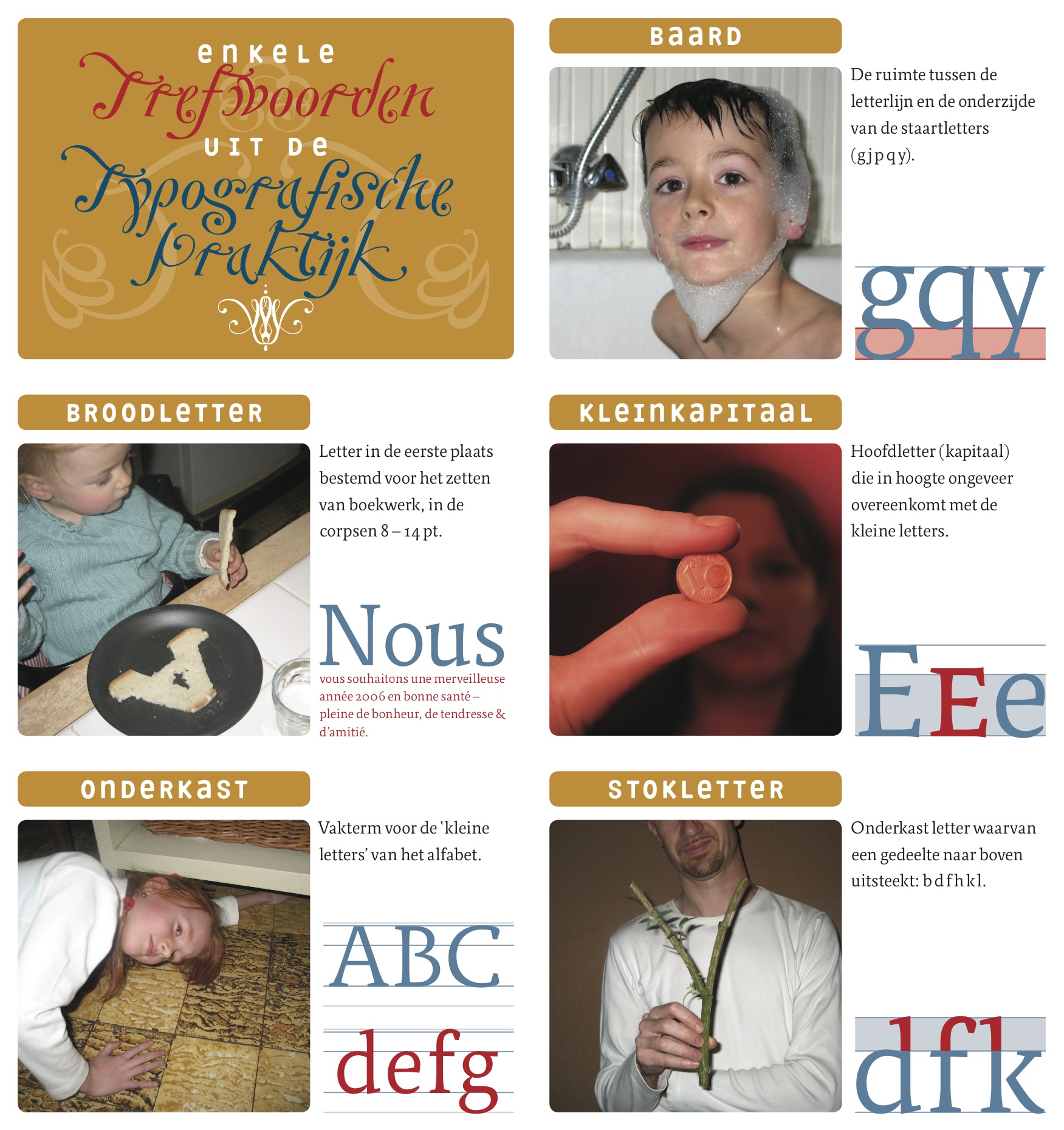
As a graphic designer I am quite proud of my 2006 New Year’s card “A Tiny Treasury of Typographic Terms”. Five Dutch and five English typographic terms were visualised in a humorous way using family snapshots. The design isn’t ground-breaking, but conceptually it perfectly embodies my approach. Regarding my writing the ScreenFonts series – my monthly reviews of movie posters – seems to have struck a chord. By combining design and typography criticism with pop culture I managed to attract a wide and very diverse audience to The FontFeed. Although the tone of my posts is conversational and often irreverent, I try to bring solid, well-researched content and a balanced opinion.
What inspires you?
Mostly pop culture – I listen to music a lot and play in two rock bands; I read books, magazines and comic books; I like watching movies and quality television. The fact that I am not entirely immersed in the world of graphic design and typography may have prevented me from becoming a true notoriety in my field, yet I hope to offer a different and fresh perspective.
Which character/letter would you take to a deserted island?
I’d take the “U”, because having a “you” would make the island a little less deserted I guess.
TYPO Berlin 2011: What are you especially looking forward to?
Finally meeting a number of type designer friends in the flesh, as well as seeing some people I admire speak. And TYPOnight of course, cuz I’m a… dancing foo-oo-oo-ool! (The beat goes on and I’m so wrong.)
For TYPO-veterans: Your favorite TYPO-moment?
Ebon Heath’s inspirational presentation “Building a Typographic Ballet” at TYPO Berlin 2009. And the sheer lunacy that was 2008’s Font Fight.
Required reading: What are currently your favorite interesting/beautiful publications, books and interesting links?
Online: Fonts In Use, The Ministry of Type, The Art of The Title Sequence, For Print Only, Brand New
Offline: The Walking Dead comic book series, Randall Casaer – Sleepyheads, Eye Magazine, 8 Faces, On Century of Type and Teaching Typefaces In Leipzig, Typography for Lawyers


Pingback: TYPO Berlin 2011 “Shift” Is Coming | The FontFeed