Randa Abdel Baki and Pascal Glissmann: Bilingual typograpic systems and exploring bilingual signs

Randa Abdel Baki lives in Beirut, a multicultural city where you can read or hear three languages at any given time. Maybe her creativity finds its source in multicultural shapes of arabic and latin typefaces set next to another. After having exporting her ideas around the world for several years, Randa came to TYPO Berlin today to introduce us to arabic and latin letters back to back. How can two different alphabets both fit on the same page? Well, Randa and her students came up with some surprising results. Six bilingual systems were presented to us through examples of book covers, cds, posters, etc. Here they are.

© Alexander Blumhoff

Pascal Glissman, Foto © Alexander Blumhoff

• The axial system where both languages share the same spine since arabic is read from right to left and latin the other way round: why not share the same spine?

• A mirroring system; very effective on spreads, where both pages reflect the same message, but in their own direction and own language.
• The interlacing system, simple and kind of musical, one piece with arabic letters, followed by a next piece with latin letters.
• The bilateral system arranges groups of content by size since arabic paragraphs look smaller the type is set bigger.
• The random system breaks the grid: lucky designers can make the best of their creativity here.
• Last but not least, the complementary system: maybe the most bilingual of all, since a title may be set in arab and the rest in latin for esthetic reasons.


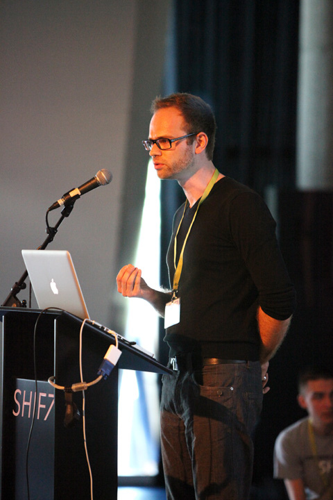
Pascal Glissman followed, comparing two very different bilingual urban landscapes, Beirut and Hong Kong. Through a series of photos, Pascal pointed out the contrast between both cities. Hong Kong had many street signs of restrictions and obligations for chinese and anglophones, the decor seemed to supply the people, pipes on walls, plugs everywhere. In Beirut on the other hand, the landscape seemed more chaotic: dilapidated walls with graffiti, serving as stages for the people’s voice. Posters ripped apart, glued on top of each other; political messages, responded to by other expressive inhabitants. Yet somehow, chaotic Beirut seemed full of life, whereas Hong Kong appeared spotless and cold. These urban spaces inspired Pascal Glissman and his students to develop typefaces, for example a chinese typeface inspired by a scaffold and an arabic typeface inspired by chaotic walls. Want to see more? www.fridayfonts.com

Randa Abdel Baki

Randa Abdel Baki

Randa Abdel Baki is a scholar, design educator, graphic designer and an artist living in Beirut. She is currently the chairperson of the Graphic Design Department at the Lebanese American University. She graduated and worked extensively as a designer and art director in New York. Concurrently, her artwork has been exhibited internationally. Her interest as a scholar is highlighting successful bilingual typographic methods tackling the challenges of Arabic and Latin bilingual layouts.
Pascal Glissmann

Pascal Glissmann

Media Designer (New York)

Pascal Glissmann is a media designer, artist, scholar and founder of the studio subcologne. He is currently Assistant Professor of Art, Media and Technology at Parsons The New School for Design. Pascal holds an MFA in Media Arts/Media Design from the Academy of Media Arts Cologne and a BFA in Communication Design from the University of Applied Sciences Duesseldorf. He joined the Academy of Media Arts Cologne as a full-time faculty in 2001 and focused on creative approaches to new media and technology within applied design projects and emerging installations. He became Assistant Professor at the Hong Kong Baptist University, Academy of Visual Arts, in 2007 where he set up the curriculum and infrastructure for the areas of media design and media arts. In 2010 and 2011 he was Visiting Assistant Professor at the Lebanese-American University, School of Architecture and Design, in Beirut.

– Louis