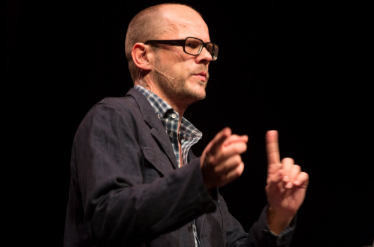
He shares some of his commercials and comments that he is not always recognized for being a typographer as well. Sometimes he does his own storyboards and works with stylists.
He wasn’t trained in music or video industry. He worked with a company that designed VH1 Classics. They went through the exercise of exploring how music covers are designed. Through that project, they got directing jobs. We watch some hilarious videos from the 70s art-directed by Jens, based on his personal experiences. We jump to FUEL TV ad with vibrant colors, music and storyline. He worked with dialogue for the first time in FUEL TV Make It Don’t Break It ad.
He designed a lot of posters early on, but they were not bought because they didn’t “belong to the marketplace”. He feels Logo’s are not meant to look good, but look right. Jens’ wife designs logos and type as well and she is the one who designed the logo for the airline for the TV show Lost. She also worked for the movie Minority Report to design the font for the fictitious corporation in the movie. He did a pitch to ESPN for redesigned typeface for online graphics. But ESPN found it too “European”. For IMF, they went to Olympic color range with geography and flag references. Rover from 2004-2012 was inspired from Futura Maxi.The CIA Compendium from1997 was his thesis from grad school. The locus changes over the sentence. Nothing matches. There is no universal shape for a letter. He played with the skeletal font and a fleshed version. He started drawing in a monochromatic sans serif. He experimented with all skeletons and played with what genus are out there. The typeface was then organized in five different families. The formula can be used for many fonts and it can be an unending process.
Text — Deepika Padam


