Hands on Type at TYPO “Touch”

Around this time 18 years ago we launched the website of our first font conference FUSE 95. We loved the conference and we loved meeting people dedicated to type as much as we are. FUSE was much of a hands on event with a ‘lab’ where fonts were freshly brewed while the conference was running.

FontShop: FUSE 95 Logo

Now that the FontShop conference is coming of age, we decided that like FUSE 95, TYPO Berlin 2013 will focus on the topic of type and typography. In addition to talks by leading type experts like Gerry Leonidas, Paul Barnes, Henrik Kubel, Albert-Jan Pool, Sander Neijnens, Roland Steiger, Julie K. Andersen, Ferdinand Ulrich, Nadine Chahine, David Demaree, to name a few, there will be contentious performances with high entertainment value to engage our audience into hands on activities.
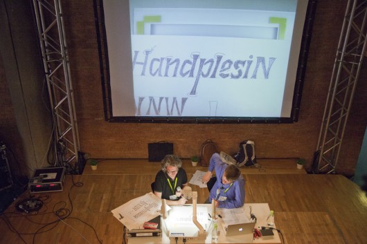
 

TYPO 2012: type cuisine

After a very successful debut with lively audience participation at TYPO 2012, award winning master chefs at Chez Type & Media (5 asterisks) Van der Laan and Van Blokland will reveal once again how to cook up new ideas for type. Using state of the art technology, the chefs will demonstrate some of the best kept secrets of their kitchen.

Whip up appetizing letters in minutes and get a taste for the secrets of hand chopped ingredients. Roll up your sleeves, the chefs will cut to the bone when critiquing your work. Bring your own Moleskins and pens.
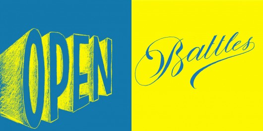
TYPO 2013: Lettering vs. Typography openbattle

A world premiere will be the first Lettering vs. Calligraphy duel before a live audience. At TYPO 2013 Martina Flor (ARG) and Giuseppe Salerno (Italy) will bring their popular website battle onto stage. For the first time they will compete live against each other.
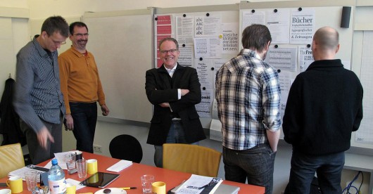
TYPO 2013: FSI Type Board

Another premiere we look forward to will be the first public meeting of the FontFont type board, which curated one of the main font libraries of the last 20 years: Type board members Erik van Blokland, Stephen Coles, Erik Spiekermann and Andreas Frohloff will discuss type submissions, criticize them, insult or praise them. The show will be presented by Ivo Gabrowitsh and Jürgen Siebert. It will provide crucial insights into what makes a good typeface.

Todays world of typefaces is very much alive and spirited. We want to give TYPO 2013 visitors the opportunity to touch it. Register now …

Paul van der Laan

Paul van der Laan

Type Designer, Typographer (The Hague)

Paul van der Laan lives and works in The Hague and is founding partner of Bold Monday typefoundry. He is also staff member of the KABK Type & Media masters course in type design. He has designed a diverse collection of typefaces including Oskar, Flex, Feisar, and a variety of custom fonts for worldwide clients such as Audi, USA Today, General Electric, NBCUniversal and Rijksmuseum Amsterdam.
Erik van Blokland

Erik van Blokland

Type Designer, Programmer (The Hague)

Erik van Blokland is Co-Developer of  robofab and UFO. He works as Type Designer and programmer and he teaches at Type & Media at the KABK in The Hague.
martina-flor-web

Martina Flor

Martina Flor combines her talents as both a designer and an illustrator in the drawing of letters. She grew up in Buenos Aires and graduated from the Type & Media Masters program in the Netherlands. Based now in Berlin, she works with a focus on type, lettering and illustration. She is also known as the letterer behind the mask on the project Lettering vs Calligraphy and the creator of the series of workshops Good Type.
salerno-web

Giuseppe Salerno

Giuseppe Salerno is an italian Graphic Designer and Calligrapher. He has studied calligraphy since the age of 15 and integrates it often in his design work. Salerno grew up in the Italian city of Torino and after moving to Valencia he founded the design studio Resistenza together with Paco Gonzalez. He is also a member of Calligraphi.ca, a collective blog about calligraphy and the co-creator of Lettering vs Calligraphy project.
ivo2400

Ivo Gabrowitsch

Ivo Gabrowitsch is an eCommerce Marketing Director at Monotype and is responsible for FontShop, Linotype, and FontExplorerX.com. He also directed marketing activities for FontFont and FontShop before FontShop International was acquired. After having worked for several years as a media designer on different print and non-print projects, he attended the Beuth University of Applied Sciences in Berlin, where he was awarded a Graduate Degree in Print and Media Engineering. In 2006, he founded “Typostammtisch”, the regular typography meet-up in Berlin. Photo: Norman Posselt
Jürgen Siebert

Jürgen Siebert

Marketing Director / Monotype (Berlin)

Born in 1954, Siebert studied physics in Frankfurt. After receiving his degree in 1985, he worked as a science journalist, wrote his first book and moved from Frankfurt to Hamburg. There he co-founded the graphics magazine PAGE in 1986, and ran it as editor-in-chief until 1991, when he moved to Berlin. In Berlin, Siebert initially worked for two years for FSI FontShop International, where he published the first FontFonts, FUSE and the FontBook. In 1993, he took over marketing for FontShop Deutschland and in 1996, organised the first TYPO design conference; he started the Fontblog in 2004, and then in 2011, Creative Morning Berlin, as well as the TYPO offshoots in London and San Francisco. TYPO Days followed a year later. Since the autumn of 2014, he has been responsible for the German-language marketing for Monotype GmbH and initiated TYPO Labs and Brand Days.
Stephen Coles

Stephen Coles

Writer, Typographer (Oakland, California)

Stephen Coles is an editor and typographer living in Oakland and Berlin. He publishes Fonts In Use and Typographica, consults with type foundries on editorial content and with various organizations on typeface selection and licensing. Stephen is author of the book The Anatomy of Type (The Geometry of Type in the UK), and serves on the board of the Letterform Archive. He was formerly a creative director at FontShop and a member of the FontFont TypeBoard.
Erik Spiekermann © Dennis Letbetter

Erik Spiekermann

Art Historian, Information Architect, Type Designer, Author (Berlin, San Francisco, London)

Erik Spiekermann is information architect, type designer and author. Two of his typefaces, FF Meta and ITC Officina, are considered to be modern classics. He founded MetaDesign (1979) and FontShop (1988). He is behind the design of well-know brands such as Audi, Bosch, VW, German Railways and Heidelberg Printing, among others;  information systems for Berlin Transit and Düsseldorf Airport and for publications like The Economist. He designed exclusive typefaces for corporations like Deutsche Bahn, Bosch, ZDF (German TV), Cisco, Mozilla and many others. Erik is Honorary Professor at the University of the Arts in Bremen and in 2003 received the Gerrit Noordzij Award from the Royal Academy in The Hague. In 2006 he was awarded an honorary doctorship from Pasadena Art Center. He was made an Honorary Royal Designer for Industry by the RSA in Britain in 2007 and Ambassador for the European Year of Creativity and Innovation by the European Union for 2009. In 2011 he received the German National Design Award for Lifetime Achievement and the TDC Medal as well as a Lifetime Award from the German Art Directors Club. He was managing partner and creative director of Edenspiekermann with offices in Berlin, Amsterdam,  San Francisco and Los Angeles until June 2014 when he moved from that position to the supervisory board. He now runs galerie p98a, an experimental letterpress workshop in Berlin. Erik splits his time between Berlin and San Francisco and London, where his son Dylan lives. A book about his life and work “Hello I am Erik” was published by Gestalten Verlag in 2014. Photo: Dennis Letbetter
Andreas Frohloff

Andreas Frohloff

Designer Liaison at Monotype (Berlin)

Andreas Frohloff, born in Berlin in 1956, manages and develops, in his position “Designer Liaison”, the relationship to external exclusive type designers of the Monotype libraries. A calligrapher and type designer by profession, Frohloff has been hosting calligraphy workshops for many years. The lecturer at several academies was trained as a sign painter and graphic designer, and graduated in combined special studies in typography and educational sciences. (Photo: Max Zerrahn)
Gerry-Leonidas400

Gerry Leonidas

Gerry Leonidas teaches and researches typography and typeface design at the University of Reading, UK. He supervises MA and PhD research, and lectures widely. He consults on publication and typeface design, reviews bodies of work, and runs knowledge transfer projects with a twin focus on global business development, and new education initiatives. He is the president of ATypI, a founding member of Granshan Foundation, and helps organise ICTVC and other conferences. He is the Director of the MATD, the TDi summer course, and the new MResTD, a new hybrid programme on research in typeface design.
Paul-Barnes-web

Paul Barnes

Paul Barnes is a graphic designer specializing in the fields of lettering, typography, type design and publication design. He is a partner with Christian Schwartz in the internationally acclaimed typefoundry, Commercial Type. In the early 1990s he worked for Roger Black in New York where he was involved in redesigns of many magazines. He later returned to America to be art director of the music magazine Spin. Since 1995 he has lived and worked in London. He has formed a long term collaboration with Peter Saville, which has resulted in such diverse work as identities for Givenchy, ‘Original Modern’ for Manchester and the logo for Kate Moss. Barnes has also been an advisor and consultant on numerous publications, notably Wallpaper*, Harper’s Bazaar and frieze. His interest in the modern and vernacular is encompassed in his type design ranging from the contemporary such as for Björk, through to the extensive British modern, Brunel as seen in Condé Nast Portfolio. Whilst consultant to The Guardian he designed Guardian Egyptian with Christian Schwartz. He has designed typefaces for the National Trust in England, the numbers for Puma at the 2010 World Cup and most recently the numbers for the England football team for Umbro. For Commercial Type he has co designed Publico with Schwartz, and independently Austin, Dala Floda and Marian. Following the redesign of The Guardian, as part of the team headed by Mark Porter, Barnes was awarded the Black Pencil from the D&AD. They were also nominated for the Design Museum ‘Designer of the Year’. In September 2006, with Schwartz he was named one of the 40 most influential designers under 40 in Wallpaper*. A year later The Guardian named him as one of the 50 best designers in Britain.
Henrik Kubel

Henrik Kubel

A2 is an independent design and typography studio with a core philosophy of drawing new type for every project they take on. Kubel co-founded A2/SW/HK in London with Scott Williams in 2000 upon graduation from Royal College of Art. Clients include: MoMA, Penguin Press NYC, NY Times Book Review, Harvard University Press, V&A Museum, Afterall, The Body Shop, Friends of the Earth, Wallpaper* Frieze Magazine and most recently Aperture magazine in NYC. Henrik is visiting lecturer at Royal College of Art and both partners are members of Alliance Graphique Internationale, AGI. Kubel is currently working closely with Margaret Calvert on digitising and expanding her and Jock Kinneir’s Transport Alphabet. A2 publish their fonts internationally through Village in New York, Playtype in Copenhagen and the studio’s own label A2-TYPE in London.
pool-sw

Albert-Jan Pool

Albert-Jan Pool was born in Amsterdam in 1960, and studied Graphic Design and Typography at KABK in The Hague. He has lived and worked in Hamburg since 1987, first with Scangraphic and URW, later self-employed. He was a co-owner of FarbTon design agency for some time. But being a typographer is what Pool loves best: FF OCR-F, FF DIN, JET, Freenet, C&A, HEM, and other fonts. He has been teaching type design at the Muthesius School of Art in Kiel since 1995.
Sander-Neijnens-400

Sander Neijnens

Graphic Designer (Tilburg)

Graphic designer. Runs his own company Bladvulling since 1991. Besides commissioned work he initiates projects on topics that have his special interest. In 2004 he published the book ‘Shirt numbers’ about the design of numbers on football jerseys. He also wrote two books about the most versatile musical instrument, the accordion: ‘Leporello’ (2006) and ‘The Giulietti Sound’ (2008). Since 2007 he works together with poet Nick J. Swarth in the still running On-Site Poetry project. For this typoetry project he made two modular typefaces. In 2013 he designed the typeface Zwijsen Blokfont that’s used in writing education at Dutch primary schools. His latest project is the design of TilburgsAns, together with illustrator Ivo van Leeuwen.
TGG_Hafen_Senn_Stieger-125px

Roland Stieger

Dominik Hafen, born in 1967, is a trained graphic designer. He teaches in Ravensburg and St. Gallen. Bernhard Senn, born in 1965, is a trained textile designer. Roland Stieger, born in 1970, is a trained typesetter. He studied CAS Type Design with Hans-Jürg Hunziker and André Baldiger at the ZHdK, teaches in St. Gallen, and holds workshops. All three participated in a further training course for typographers from 1990 to 1992, and went to found their studio TGG Hafen Senn Stieger in 1993.
Julie K. Andersen

Julie K. Andersen

Julie is a professional dancer, turned database programmer, turned graphic designer, turned associate professor, turned influential blogger, turned craftswoman extraordinaire, turned typographic artist.
© Norman Posselt · www.normanposselt.com

Ferdinand Ulrich

Typographer / Type Researcher (Berlin)

Ferdinand Ulrich is a typographer and a design researcher. At p98a.berlin he explores with Erik Spiekermann how letterpress can be redefined in the twenty-first century. His research and writings on type history have been published in the US, in the UK and in Germany. Ferdinand regularly teaches typography (UdK Berlin, Burg Halle, FH Potsdam) and gives guest lectures (MIT Media Lab, Cooper Union, Carnegie Mellon University, and others). Since 2015 he has been working on a PhD at the University of Reading, researching the transition of type design technologies in the early digital era. The project is supervised by Gerry Leonidas and Sue Walker and is funded by the AHCR in the UK.
Square_NadineChahine

Nadine Chahine

Type Designer (London)

Dr. Nadine Chahine is an award winning Lebanese type designer working as the UK Type Director and Legibility Expert at Monotype. She has an MA in Typeface Design from the University of Reading, UK, and a PhD from Leiden University, The Netherlands. Nadine’s research focus is on eye movement and legibility studies for the Arabic, Latin, and Chinese scripts. She has numerous awards including two Awards for Excellence in Type Design from the Type Directors Club in New York in 2008 and 2011. Her typefaces include: the best-selling Frutiger Arabic, Neue Helvetica Arabic, Univers Next Arabic, Palatino and Palatino Sans Arabic, and Koufiya. Nadine's work has been featured in the 5th edition of Megg's History of Graphic Design and in 2012 she was selected by Fast Company as one of its 100 Most Creative People in Business. In 2016 her work was showcased in the 4th edition of First Choice which highlights the work of the 250 top global designers practising today.
demaree-web

David Demaree

David Demaree is a designer and programmer on the Typekit team at Adobe, where he focuses on user experience, data modeling, and generally trying to make customers happy. Since joining Typekit in 2011 David has led development of several big projects, including full-text search, integration into Adobe's Creative Cloud, and localizing Typekit's user interface. He’s also written for A List Apart and spoken about design and code at AIGA Chicago, RailsConf, and ChicagoRuby. Outside work, David enjoys taking pictures, drinking coffee, and complaining about things on Twitter. Photo: Ryan Carver