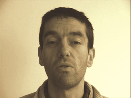
Which work are you particularly proud of? Which work best represents your style or approach?
The façade for the Figeac museum. But I don’t have any style. The work which represents best my approach is the work in progress.
What inspires you?
These days: all these short sentences pasted in the sreets (“on sale”, “to rent”, “e pericoloso sporgersi”, “un train peut en cacher un autre”), strange proverbs (“un tien vaut mieux que deux tu l’auras”, “l’homme poli ne marche pas sur l’ombre de son voisin”), definitive assertions like: “it is absurd to say, shut the door because it’s cold outside. If the door is closed it will still cold outside.”
Which character/letter would you take to a deserted island?
I would take a B for the honey, a Y for the questions and a W to have sombody to talk with. Sans serif.
TYPO Berlin 2011: What are you especially looking forward to?
To discover how we will write in 100 years.
For TYPO-veterans: Your favorite TYPO-moment?
When I came In 1995 in Berlin, at a moment during my lecture, I was so impressed that I lost my poor english. Then I switch to french and it was really better!
Required reading: What are currently your favorite interesting/beautiful publications, books and links?
In french, an essay about graphic design: Le Vertige du funambule
BACK COVER n° 4, about graphic design and typography, With contributions by: Catherine de Smet, Robin Kinross, Metahaven, Jost Hochuli, Wim Crouwel, Roland Früh.
A french comic strip about music: Charles Berberian – Jukebox
And a lot of fascinating books by small publishers presented in the Salon light in October in Paris. You can follow the links to find very interested publications: Salon Light #7 – Point Ephémère. Sélection Motto: 0_100, (Milan), 38th Street Publishers, (New York), A.R.T. Press, (New York), Aglec, (Moscou), Artspeak, (Vancouver), CAC Interviu, (Vilnius), Dexter Sinister, (New York), Eastside Projects, (Birmingham), edition fink, (Zürich), Fillip, Vancouver, Fw : (Amsterdam / Rotterdam), Graphic, (Séoul), David Horvitz, (New York), innen, (Budapest), Mediabus, (Séoul), mono.kultur, (Berlin), Paraguay Press, (Paris), Printed Matter, (New York), Prix Fernand Baudin, (Bruxelles), PROVENCE, (Lacoste), Occasional Papers, (Londres), Rollo Press, (Zürich), Specter Press, (Séoul), Utrecht, (Tokyo), Werkplaats Typografie, (Arnhem) White Fungus, (Taichung City) …


