Schwartz & Spiekermann – FF Meta Serif

„Warum seit ihr alle hier?“, fragt Erik Spiekermann direkt. Neben ihm sitzt der New Yorker Schriftentwerfer Christian Schwartz. „Warum seit ihr nicht bei Ed Benguiat?“.


Ein Einblick in den Entstehungsprozess

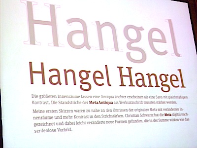
Dann legen die beiden los. Sie berichten über die Entstehung der Meta Serif, die nach Meinung von Schwartz und Spiekermann eigentlich Meta Antiqua heißen sollte. Langweilig sei die Schrift, so die erste Resonanz auf die Meta Serif. Spiekermann sagt darüber nur, dass eine Leseschrift in gewissem Sinne auch langweilig sein müsse. Es könne nicht jede Schrift so hübsch daherkommen wie die Garamond.


Schwartz und Spiekermann ermöglichten dem Auditorium durch das Präsentieren ihrer regen E-Mail Korrespondenz aus der Zeit der Entwicklung der Meta Serif, Einblicke in ihre Arbeitsweise zu gewinnen.

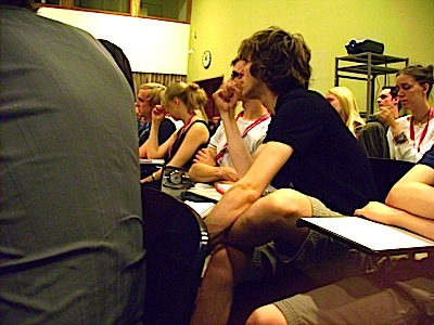
Schwartz und Spiekermann zeigten Skizzen und Zwischenstufen aus dem langen Entstehungsprozess der Meta Serif und sprachen über Schwierigkeiten und Lösungsansätze. Das anschließende Gespräch mit den Schriftdesignern war kurz und vereinzelt, da eine hungrige Unruhe unter den Besuchern ausbrach – das Mittagessen lockte.

Text: Linda Horn

Schwartz_Christian

Christian Schwartz

Christian Schwartz is principal of Schwartzco Inc., a New York-based type design and consultation firm. Schwartz has released commercial fonts with many respected foundries and designed proprietary typefaces for corporations and publications worldwide, including Bosch, Esquire, and The Guardian. Schwartz and British designer Paul Barnes began an ongoing collaboration in 2005 with the design of the Guardian family for The Guardian's dramatic new look. As part of the newspaper's redesign team, Schwartz and Barnes were shortlisted for the Designer of the Year prize by the Design Museum in London and awarded a Black Pencil by D&AD. They have also been named two of the 40 most influential designers under 40 by Wallpaper*. In 2007, Schwartz and design luminary Erik Spiekermann were awarded a gold medal by the German Design Council (Rat für Formgebung) for the typeface system they designed for the Deutsche Bahn.
Erik Spiekermann © Dennis Letbetter

Erik Spiekermann

Art Historian, Information Architect, Type Designer, Author (Berlin, San Francisco, London)

Erik Spiekermann is information architect, type designer and author. Two of his typefaces, FF Meta and ITC Officina, are considered to be modern classics. He founded MetaDesign (1979) and FontShop (1988). He is behind the design of well-know brands such as Audi, Bosch, VW, German Railways and Heidelberg Printing, among others;  information systems for Berlin Transit and Düsseldorf Airport and for publications like The Economist. He designed exclusive typefaces for corporations like Deutsche Bahn, Bosch, ZDF (German TV), Cisco, Mozilla and many others. Erik is Honorary Professor at the University of the Arts in Bremen and in 2003 received the Gerrit Noordzij Award from the Royal Academy in The Hague. In 2006 he was awarded an honorary doctorship from Pasadena Art Center. He was made an Honorary Royal Designer for Industry by the RSA in Britain in 2007 and Ambassador for the European Year of Creativity and Innovation by the European Union for 2009. In 2011 he received the German National Design Award for Lifetime Achievement and the TDC Medal as well as a Lifetime Award from the German Art Directors Club. He was managing partner and creative director of Edenspiekermann with offices in Berlin, Amsterdam,  San Francisco and Los Angeles until June 2014 when he moved from that position to the supervisory board. He now runs galerie p98a, an experimental letterpress workshop in Berlin. Erik splits his time between Berlin and San Francisco and London, where his son Dylan lives. A book about his life and work “Hello I am Erik” was published by Gestalten Verlag in 2014. Photo: Dennis Letbetter