1. Roots is the topic of TYPO Berlin 2014. What comes to your mind, when you hear this theme?
A couple of divergent thoughts:
Firstly, that working at the root level can have much more potential – and risk – than working up in the top layers. As Stanley Morison said: “What they call originality is achieved by getting down to the root-principle underlying the practice. From that origin you think your way back to the surface, where you may find you’re breaking untrodden ground.”
Secondly, that visual communication design is based on aesthetic considerations which at first appear to stem from purely subjective preferences but whose roots are deeply buried in wider social, cultural and biological conditions.
2. Which design project was good and fundamental enough to trigger modern ideas and concepts?
Anything and everything originated by Karl Gerstner, but in particular ‘Compendium for Literates’. As a student, all those years ago, it changed my ideas about what design and typography could do – that it could be both critical and exploratory. And then there’s his ‘Designing Programmes’, written in 1964, which Richard Hollis described as “what the future of graphic design is largely about”. Gerstner is a true visionary and one of the very few people who has elevated the role of the graphic designer by redefining it.

Paul McNeil
3. What relationship is there between your work and the TYPO theme?
I like to try to work at the root level and in the projects I’m currently undertaking with Hamish Muir we focus specifically on the construction and arrangement of component forms, typically modular letters, that can be used to generate complex typographic architectures without a great deal of local intervention.
4. Which are the 3 projects you are particularly proud of, and why?
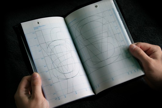
‘Core’, a geometrically and statistically generated sans serif used as the basis for an extensive ongoing programme of experimental typeface designs which explore aspects of mechanised visual language. (2001-)


Core / © Paul McNeil
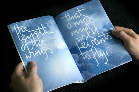
‘Bwirds’, an unfinished attempt to confine unruly handwritten wordforms to the restrictions of a grid. The intention is to implement this as a typeface with automatic variations in forms based on entry and exit points. (2008-)

Bwirds / © Paul McNeil
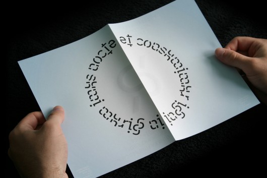
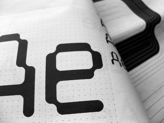
‘ThreeSix’ is an experimental optical/geometric type system of 6 typefaces in 8 weights. Hamish Muir and I have been working on it collaboratively for a few years now. It started life as a research project where our goal was to generate geometric type forms modulated through a series of optical interventions to see if it was possible to create a purely geometric type system which would be readable at small sizes.

ThreeSix / © MuirMcNeil
5. Musts: What are, currently, your favourite books, exhibitions and artists?
Books:
I like to keep a few books on the go at the same time. Currently, uppermost is David Foster Wallace’s essay collection, ‘Consider the Lobster’, in which he forensically considers not only lobsters but also women’s tennis, global catastrophes and the porn industry. Then there’s Steve Martin’s ‘Born Standing Up’ which is, unexpectedly, not that funny but all the better for it; and Hugh Howey’s “Wool” a self published sci-fi story which is so terrifyingly dystopian that I’m not sure I will get to the end but know that somehow I will.
Of course, I also have a crippling addiction to books on design and typography. Best thing I’ve bought this year so far is ‘Imprenta Real Fuentes Tipograpfica Espanola’, stunningly produced and also, thankfully, bilingual.
Exhibitions etc:
As far as recent exhibitions go, Paul Klee at Tate Modern: 10/10, Xu Bing at the Ashmolean: 8/10, Memory Palace at the V&A: 0/10. Favourite artists, there are too many to count, but Erwin Heerich is always a source of interest and inspiration.
6. Give us 3 (digital) tools you currently cannot do without:
Fontlab, Illustrator and InDesign although they are all exasperating in their own ways.


