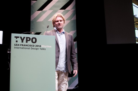
Nine years ago, after living in Amsterdam for 22 years, Knip decided it was time to get out of the city. He bought an 18th century farm and fixed it up into a home and working space, where he now works and lives with his wife and boy. He initially went to school for art, where he encountered type through dry etchings and printmaking. While working on typography with his hands was interesting to him, there were many designers at the time working on more classically structured typefaces, and he wanted to find a way to break out of it, that’s how he came to work with environmental typography.
Knip draws his inspiration most from environmental typographic forms he finds in his journeys. Forms that came not from a designer with rigid aesthetic sensibilities, but rather simply from a person whose goal was to communicate a message with what they had, even if the result was eclectic. In this sense it is truly about communication more than design. For him, the moment where his work became the most enjoyable was when he decided to detach himself from what was going on in the design community — what was hip, what was out of style — and simply focus on the work that he wanted to. Because of this, he has freed himself into making things that may go against what is considered conventional in the typographic community, there are several cases where he has made a typeface in one week or even one morning.
He discussed some of his famous work: the type for the Afrika Museum in Berg en Dal, the alphabet for Amsterdam’s Royal Concertgebouw Orchestra, the TextielMuseum in Amsterdam, and many more. He talked about how much joy he finds in exploring a loose parameter you have set for yourself. Above all it is about the joy.
He wrapped up his talk by walking through some of the projects contained in his ARKTYPE.NL website; a collection of some of his architectural typography that will be for sale for the first time, before now none of Knip’s fonts have been available for purchase by the general public. He also discussed a book and project he created out of letters drawn by children, which he found particularly interesting because these letters are representative of the pure idea of what a letters form should be.
In closing, he urged the crowd to follow their instincts in design, think about how you would have solved the problem as a child, and remember that you do not always have to open your laptop to make a project.
– Jack Koloskus, @koloskus


 Photo by: Amber Gregory


