Photo: Gerhard Kassner
The first font introduced is Ubuntu – a Linux based open source operating system font. Meaning the client consists of 20 million people who all have an opinion. This community is made up from serious geeks that speak every possible code that is out there. So what do you do when everyone is your client – you use this network for your research and decision making. Bruno and his team explain the fine line between aesthetics and practicality – which might be decided by user functionality. As with every typeface testing is a constant parallel process to optimise legibility and usability. To test it yourself you can download the font for free here:
font.ubuntu.com.
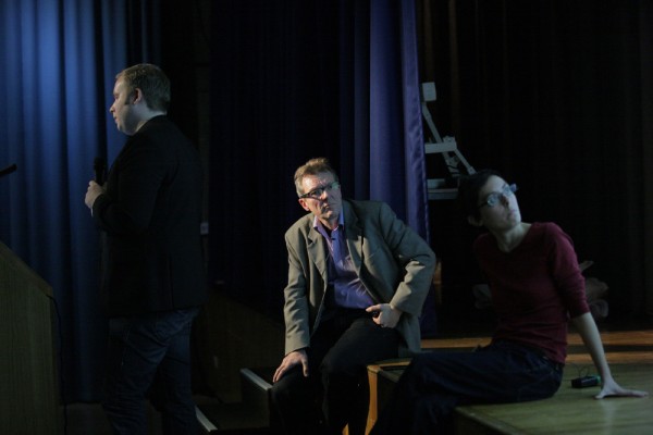
Photo: Gerhard Kassner
Next up is the client of the team – Nokia. They seem to be a dream client – realising themselves that a unique typeface has to be part of the overall product package in combination with a matching screen font. In three words they described their brief: simple – Finnish – natural. Sticking with the theme of collaboration, the two teams met every week to look at the process, test the fonts and make design decisions. ‘What does the user need? An elegant or a fancy g?’ The client was so happy that he even organised a launch party for the new font. Which proved to be a great marketing event. The whole process was a collaboration between client – designer and user. This process is documented in a recent publication by Gestalten. Good type pays off!
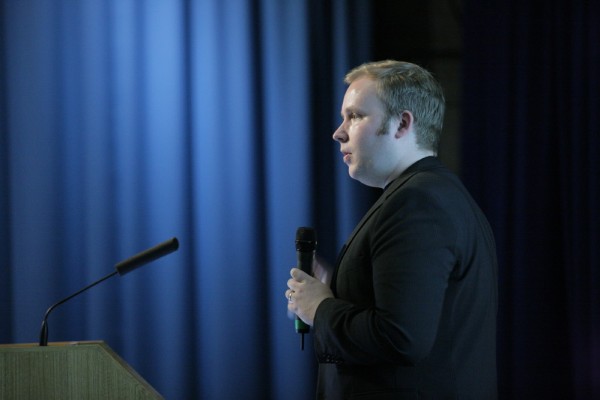
Photo: Gerhard Kassner
Type designers are always seen as the nerds in design – and when you see the attention to detail and amount of non-Latin sets Dalton Maag’s fonts come in – you might think they are. For one single font called Aktiv Grotesk they created every possible character and extended version, even now creating a Chinese, Thai and Arabic set.
With a network of native speakers all over the world and offices in London and Brazil – type design is not just one craftsmanship but a collaborative effort of knowledge – which can be found at Dalton Maag.

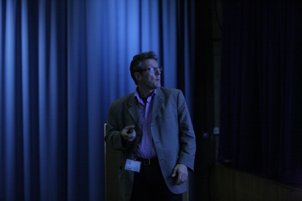
Bruno Maag was born near Zurich in 1962. After an apprenticeship as a typesetter for the Tages Anzeiger, Switzerland's largest daily paper, he fell in love with the smell of ink and the clatter of printing machinery. His passion for letterforms led him to study typography at Basel School of Design. Bruno cut his professional teeth designing type at Monotype, both in the UK and in the United States, where he designed fonts for the New Yorker magazine, in 1990.
He established Dalton Maag in 1991 with his partner Elizabeth Dalton, painter and illustrator. Over time, Dalton Maag has grown from a one man show to a relatively large foundry with studios in London and Brazil. Today, the cream of type design and type technology professionals work for Dalton Maag.
Bruno and the design team create fonts for companies and organizations such as Tesco, Toyota, Burberry, Southampton City Council, and more recently Ubuntu and Nokia. A speciality of the company is its expertise in non-Latin scripts, including Arabic, Cyrillic and Greek.
Bruno is passionate about type and sees himself as a craftsman rather than an artist. As well as designing, Bruno is a travelling evangelist for good type. He contributes to graphic design titles and is regularly called upon to comment in the design press.
Text — Joana Niemeyer and Sandra Zellmer — GraphicBirdWatching


Pingback: Fontblog | TYPO London 2011 im Rückblick