Some, not surprisingly, were those created by modern technology. Others, perhaps even more fascinating, sprang (or rather emerged) from the past. The intention of the global experience language (GEL) covers both a general atmosphere for the user experience, and, a specific and authentic reflection of Arabic script as it appears on the multiple news sites operated by the World Service.
The interface project started with a general review of the use of screen real estate across competitor news sites, and paid specific attention to the balance between hard and soft news stories – how were they placed, presented and consumed? The differences (Brazil: a mix of hard and soft, Russia: 100% hard news, China: the land of pop ups with everything) were then replicated in the BBC’s interfaces, some of which are launched and others due soon. But it was when Titus began work on the development of the typefaces themselves that a surprising historical and technical quirk created significant challenges alongside a genuine opportunity.
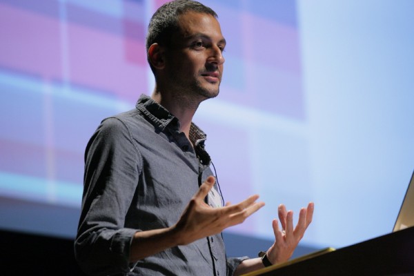
Kutlu Çanlıoğlu (photo: Gerhard Kassner)
Put simply, when Arabic was simplified for application on typewriters and in hot-metal, a number of critical aspects of the true character of Arabic type were lost in the process. The change in structure of single letterforms, which occurs to add or bring context in Arabic, was lost. So the constraints of previous technology meant that new Arabic type forms were – in some cases – simply repeating the truncated versions of the past where a whole range of accents and marks had been stripped back to just one or two alternatives.
In taking Arabic from metal to line-casting, the opportunity to re-appraise, extend and give a true reflection of one of the most wonderful aspects of Arabic typography was lost. Foundries simply copied the structure they adopted from one technology into the next. Certainly the quicker and more cost effective option, but also a lazy one too with no acknowledgement of what newer technologies offered. More importantly, no acknowledgment of whether the fundmentals of any non-Arabic font were truly and accurately represented. Titus naturally has opted to be a vanguard of acknowledging this missed opportunity and doing something about it.

Kutlu Çanlıoğlu is Senior Creative Director for BBC World Service, a role where he is responsible for the user experience and design of 27 different language services, including those in Arabic, Russian, Mandarin, Hindi, Urdu, and Spanish.
He studied architecture and sociology at Istanbul's Mimar Sinan University before working as a graphic designer at the daily newspaper Radikal. He then joined EK Ltd, a studio specialising in editorial design, and worked with a wide range of print and digital projects for clients including the UN, Istanbul Foundation for Culture and Arts, Goethe Institute, Unilever and Wyeth.
He moved to London to complete an MA in Typography at the London College of Printing where he gained recognition for exploring the relationship between type and punctuation in an innovative and ambitious interactive motion graphics piece.
At the BBC World Service he runs a team that designs news websites and mobile products across nine different scripts as well as the multi-lingual content management systems that drive them.
He is also responsible for info-graphics and data visualization projects to support the 24/7 multi-lingual news coverage for diverse audiences around the world.
Kutlu is also the Typography Discipline Lead at the BBC, responsible for championing the role of craftsmanship around typography in the context of the BBC's new Global Experience Language.

Titus Nemeth is a typographer, a student, and a teacher. His area of interest centers around Arabic and non-Latin typography. As a frequent traveller, his outlook is worldwide, privately as well as professionally with clients such as the BBC World Service, Fontsmith UK, the Brill publishing house in the Netherlands and WinSoft in France.
He works independently as designer and consultant and teaches at the ESAD Amiens, France, and the ESAV Marrakesh, Morocco. Since 2010 Titus researches aspects of the history of Arabic typography as a PhD candidate at the University of Reading, UK.
Titus Nemeth studied Graphic Design at die Graphische in Vienna, Austria, and holds an MA with Distinction in Typeface Design from the University of Reading. He studied Arabic in Syria, taught typography as an Assistant Professor at the VCUQ in Doha, Qatar, and pursued research at the post-diplôme of the ESAD Amiens.
His work has received numerous awards, including the Type Directors Medal for typographic excellence and the European Design Award.
Titus Nemeth is a member of ATypI, the TDC New York and Design Austria.
From what he showed, the work he has developed alongside Kutlu and the BBC World Service probably gets as close as is currently available to a type family that reflects the nuances of Arabic as comprehensively as possible.
Text: Patrick Baglee


Pluriversum|October 21, 2011
I saw the beginning of this interesting speech but had to leave then due to an appointment. Is there any way to see the recorded livestream again? That would be awesome
Pingback: Fontblog | TYPO London 2011 im Rückblick