


Which work are you particularly proud of? Which work best represents your style or approach?
Well besides my work for the foundry I’m doing a lot of other stuff (mostly webbased) which I’m keen on, but that’s the more serious/complex stuff … But I think you mean my typographic and typedesign stuff I’m doing for VetteLetters, right? Well, I’m still proud off the video we made for the famous Dutch singer Caro Emerald. We will tell about this video on TYPO. But also typeface Bint, a potato-cut font. It took me a short vacation to made/cut it, but now it’s one of our best-selling fonts ;-). More recently my intern and I worked on a cloud-font experiment: An OpenType font to create ‘clouds’.
What inspires you?
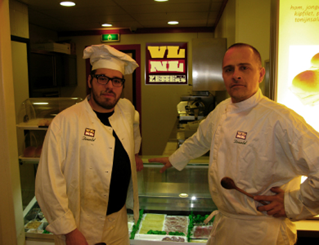
Well of course there are some great typedesigners and typefaces out there that I’m admire. For instance the TEFF Lexicon by Bram de Does is the best font ever … But I’m really inspired by the small imbiss/fastfood restaurants/Döner Kebap stores/snackbars. Pictures of the cheap food on the walls, accompanied by real bad typography. This kind of restaurants are open early and close late. The owners are trying to create some atmosphere of a real restaurant with good food … while everybody is coming for the bad junkfood. People eating alone … I dont know, it intrigues me a lot, it’s so disconsolate and comfortless… when I started my foundry VetteLetters, I had that in mind. VetteLetters is the font-imbiss in the world of exclusive and expensive font foundries.
Which character/letter would you take to a deserted island?
Well, if the island is deserted, I’m a alone out there and there is nobody to read my character/letter … so I would say: maybe the U, because it’s sounds like “you” in English. So that means: me and U makes two. Or even better: W, the “double you”. So Me + double U makes three. And “three is the magic number”, right?
TYPO Berlin 2011: What are you especially looking forward to?
Well … I love Berlin, the beers, the bratwurst, the imbiss. See old friends and meet new ones. There are some good sandwiches in the speakersroom. To scoor some nice T-shirts, TYPOnight … and of course al the lectures.
For TYPO-veterans: Your favorite TYPO-moment?
Well, do you think it’s selfish to say my favorite moment was the gig I did with Wolfraam (the “world famous” typographers band) at TYPOBerlin in 2007.
Required reading: What are currently your favorite interesting/beautiful publications, books and links?
Well, I’m reading a lot about WordPress, I would like to use that CMS to rebuild VetteLetters an Typebase later this year. In bed I’m reading now “Just my Type” by Simon Garfield, a book of stories about fonts. Nice stories how for instance Comic Sans took over the world. About typo on the web: I really like TypArchive.com. It’s a site containing a lot of inspiring pictures of hand painted and three dimensional lettering. Since a couple of week Photolettering.com by House Industries is live. I’m proud to digitized two of the presented typefaces (Buffalo and Quicksilver).


Pingback: TYPO Berlin 2011 “Shift” Is Coming | The FontFeed