


What associations does the term “trigger” invoke for creatives and marketing mavens? Of course, it’s about speaking to a target group, about a tingling of the scalp, about a message that nobody can miss, about the numbers in the little red circles on our smartphones, about trends at the centre of everything, and about brands that become triggers themselves. And maybe also about the state of the world, where nearly unpredictable figures have their fingers on the red buttons of power, and advancing digitisation is an early indication of the upheaval to come in the life and work habits of humans.
From motto to logo to type and back
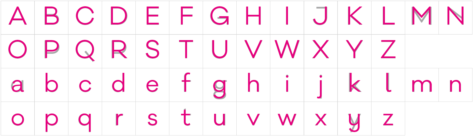
The double “g” in the word “trigger” is an invitation to a typographic solution. In a grotesque font, the uppercase “G” looks like a circular arrow – similar to the icon for “reload”, which is often seen rotating. The idea was G meets a rotated G to create a reflexive loop.
But a long search failed to turn up a typeface in which the G was consistently designed geometrically and with respect to point symmetry. The font family Galano Classic, a modern type design by René Bieder with a variety of letter variations, came closest. But it wasn’t quite right. So clearly, the thing to do was call up the font designer.
Targeted typeface adaption – custom font design
The logo design, with the rotation effect on the GG ligature, was intended to emphasise the geometric centre axis on some of the uppercase letters.
The letters with a visible centre axis, B E F G R P, were re-drawn. They were combined with a selection of existing upper and lowercase letter variations to make a unique set of glyphs, which can be used in print on the web without the extra selection of a sub set. A particular bonus is the appearance of the TRIGGER LOGO when you type that combination of letters. That and a series of special characters that can be used, say, as arrow symbols in web design, are also integrated into the font.
So a new typeface, “Galano Trigger”, was created just for TYPO Berlin 2018. Now all communications about the conference, down to the smallest detail, provide a constant connection to the logo and the brand design.
Type remains the basis of brand communications
Texts typeset in strong fonts are also the basis of (brand) communications on social media and other web-based editorial outlets. The design is directed at connecting emotional images and concise text messages.
They say that a picture is worth a thousand words, but words are a thousand times more precise than images. So if you want to make a statement shorter and more pointed, text is often better. The use of an appropriate and striking font creates a tangible link between the message and the brand that goes beyond branding, which can sometimes evoke feelings of annoyance. And font design enables long-term continuity in brand communications, providing the freedom to act with a greater eye to trends in delivering picture messages in visual concepts that tend to be more short-lived.
Many typeface designers offer custom font designs based on their own type families. The big font platforms also offer it as a service. Communications and font designers can work together on this to create targeted solutions that can improve marketing strategies.
Text — Magnus Hengge


Pingback: TYPO Berlin 2018: 5 Questions With Program Director Jürgen Siebert – Rad Intelligence