


Term 1: forensic typography
Being the art and craft of taking the meagre fragments of a non-codified alphabet or letterform design, and through a process combining guess work, considerable skill, historical research and witchcraft, arrive at a complete alphabet design, including alternates, sorts, ligature and numerals. Described by Michael Bierut (‘ier’ as in sex’ier) in his project for the wayfinding (see also wayshowing) at Lever House in New York City. As executed with considerable skill by Jonathan Hoefler and Tobias Frere-Jones.
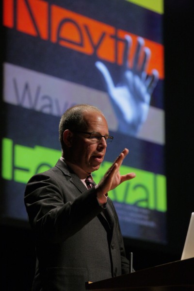
Michael Bierut, photo: Gerhard Kassner
Term 2: graphic archaeology
Being the diligent exploration of a combination of genealogy, geography and primary graphic artefacts in self-realisation of ones own creative approach. Described by Tony Brook as a means of joining up his own Yorkshire upbringing with the graphic influences present in his parent’s attic. Care must be exercised in the sourcing of correct references in all aspects. For example, describing Malcolm Garrett as a member of the ‘Lancashire’ creative collective is to ignore the fact that Garrett was, according to current understanding, born on the lower lying Cheshire plains.
Comments and existing precedents welcomed.

Michael Bierut
Michael Bierut studied graphic design at the University of Cincinnati’s College of Design, Architecture, Art and Planning. Prior to joining Pentagram’s New York office as a partner in 1990, he was Vice President of Graphic Design at Vignelli Associates. His clients at Pentagram have included The Council of Fashion Designers of America, The New York Times, The Museum of Arts and Design, United Airlines, The Brooklyn Academy of Music, Harley-Davidson, Princeton University, the Morgan Library and Museum, Saks Fifth Avenue and the New York Jets. He has won hundreds of design awards, and his work is represented in the permanent collections of museums around the world. In 2002, Michael Bierut co-founded Design Observer, a blog of design and cultural criticism. Today, the site is the largest design publication in the world. In 2008, he was named winner in the Design Mind category of the Cooper-Hewitt National Design Awards.
Text: Patrick Baglee


Pingback: Fontblog | TYPO London 2011 im Rückblick