


On his return to Germany to see to his family, he received a fax from his town elders to say that his grandfather had died. Bansah never hought that he would be next inline for the throne due to a sizeable family – his father had 12 wives and he has 72 siblings! However, there is a stipulation for Hohoen kings that they must be right-handed and as his father was not, he would be the next King. Bansah was crowned King and rules his people all the way from Germany!
When referring to his new role, King Bansah is utterly self-effacing, brushing off any ideas of a new grandeur and insisting that with royal status comes a lot of responsibility and sacrifice – his problems have grown tenfold. His medical transport duties have increased massively and he now transports large containers and ambulances to Hohoe. But this is only the tip of the iceberg, since his inauguration he has been busy building bridges and schools, organising beneficial football matches, opening stores, overseeing his own beer range and is inundated with invites to sing at events and on TV shows. The King
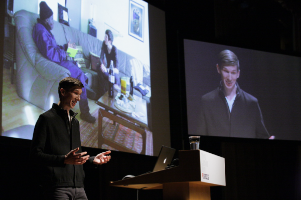
loves to entertain! Julian played footage of King Bansah’s performances which were well received as an amusing respite to an intense day of information.

Julian Zimmermann
With all this promotional work and acclamation came a need for a strong identity. Julian approached the king as part of his thesis project to re-design and re-invent his European profile. To try and understand King Bansah’s appeal and core values, Julian created a chart of royalty divided into four sections entitled Royal, Exotic, Western and Entertaining. They concluded that he sat somewhere between Queen Elizabeth and the Lion King and the basis for his identity was one of royalty and exoticism! To gain further research and insight, Julian travelled to Ghana alongside King Bansah. Julian chose the colours gold and black for the King’s new identity. Gold for royalty, which was a significant motif in the King’s garments, and black to represent his exotic heritage.

On examination of the old coat of arms, he decided that some elements were outdated and irrelevant. The original knight shield was dropped but Julian wanted to maintain the narrative within the emblem. This told two stories, the king helping a hungry layperson to get fruit from the tree of life and the voodoo rock which protects the Horoen people from crocodiles. A complex mix of ingredients to say the least! For the new identity Julian pared back the stories into four icons. These icons sit within an emblem consisting of four diagonal lines radiating from a ‘B’ in the centre. There is a horizontal line which leads from the emblem to an icon of a crown which sits above. There is balance and harmony within the logo while retaining the important narrative. Julian used geometric shapes of traditional Ghanian textiles for the trimming and all the literature is printed using luxurious gold ink on black and white stock. This new identity was applied to a stationery suite, packaging for the King’s Akosombo beer, flags for his limousine and autograph cards.
Assuming the talk would be one of the days more bizarre lectures, I was not incorrect, however, it was not all jokes. I left the talk moved by the heartwarming narrative of the King’s desire to make worthy changes in his home town. It was a great insight into a unique project which transcended into a beautiful identity. In the words of RUN DMC, I’m down with the King!
Tetx — Deirdre Breen — Graphic Birdwatching


