


New York is reflected in Triboro’s broad portfolio ranging from music packaging to startup brand identity to corporate campaigns to publications to exhibitions to celebrity fashion lines. Although the two have no preconceived notions or house style and approach “each assignment as an opportunity to go on a creative journey,” the city’s impact can be seen in much of their aesthetic.
Focusing on “roots,” the pair explored how New York, with its “geography and people in a state of constant flux,” serves as their muse. They compared the creative process to walking around the city and finding surprises around every corner.
Triboro draws these inspirations from the high-brow contrast and intrinsic link between commerce and art, as well as the quirky “low-brow” visual landscape of the city, from deli signage to abandoned buildings. “We design objects that have a sense of history, so people will treat them with respect,” they said, illustrating with examples of a dog-tag influenced William Rast product tag and campaigns for clients like Stella Artois modeled after ghost ads around NYC.
The city doesn’t only influence Triboro, but they question the status quo and influence New York itself. One of their biggest projects was a redesign of the New York subway map. They created a custom typeface for the larger text and used Gotham for the small type. (“Why use a Swiss typeface for an American map?”). Then in “an absurd infographic paradox, after so much care went into the design” they picked a neon red for the color. The creative challenge allowed them to promote the studio, and the buzz they generated from posting the map in subway stations, led to the poster still showing up in lifestyle magazines and a meeting with Massimo Vignelli.
Living in New York, they realize that as designers, they must cut through the chaos by doing something differently for clients. For client, BLK DNM, they created an identity system based on constant repetition, use of limited type/color and presenting the models in an unexpected way. Similarly, for client GQ, they challenged the static grid of a printed magazine and mimicked the digital experience for the printed GQ Style Manual.
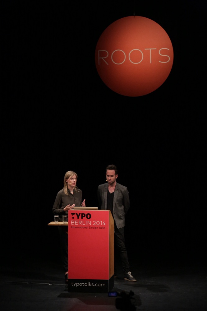
The aggregate natural and cultural history of the city influences the look of their projects. A TDC project they did questioned the concept of perfection by mimicking the way weather and age can change design. They drew upon the former cultural grittiness of the East Village to create restaurant and cafe branding for a new luxury hotel in the storied neighborhood. They allow themselves to experiment with these influences too, whether its taking a “fuck readability” attitude toward magazine layout or printing their rejected work as Triboro Leftovers.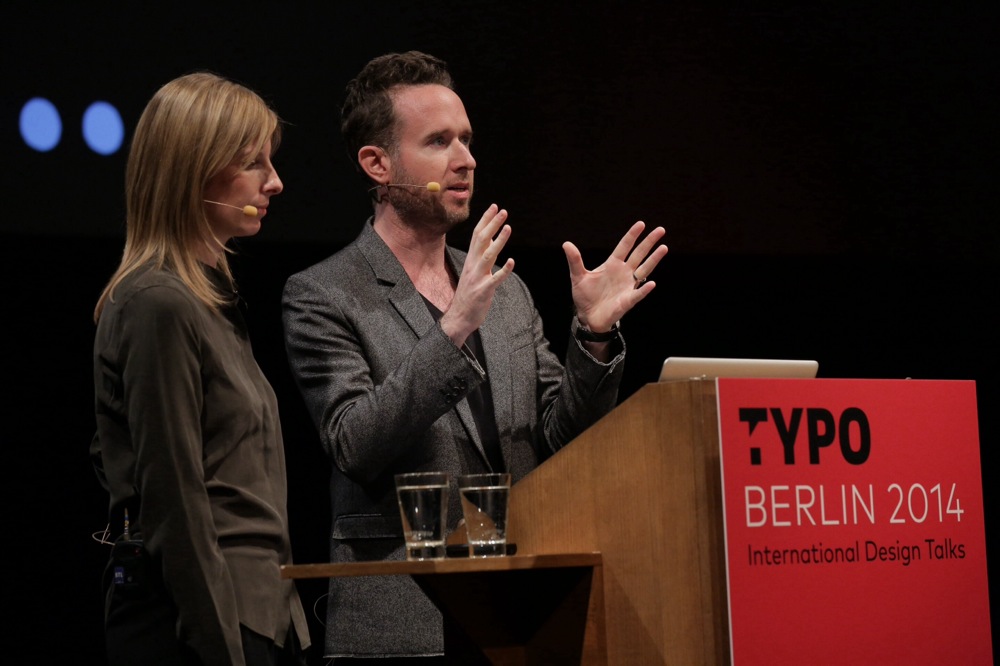 photo © Gerhard Kassner
Triboro wrapped up their presentation with their Nike-commissioned New York project to design a logo for the city. They wanted to link back to the Nike heritage brand, and initially didn’t want just another typographic representation of New York/NYC/etc. They decided to marry “Just Do It” with Do It Yourself and thus was born the logo, changing Nike into NYC. This allowed customer participation and transforming classic Nike ads into New York-themed ads. The city influencing not only their studio, but a classic American brand.
Text — Meghan Arnold


