1. Which work are you particularly proud of? Which work best represents your style or approach?

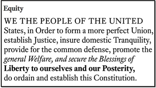
- Matthew Butterick’s Equity font

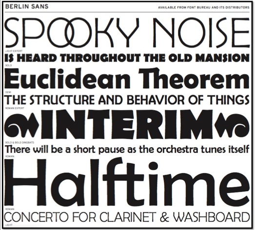
- Matthew Butterick’s Berlin Sans font
2. The theme of this year’s TYPO London is »Social«. Do you consider design to be a social discipline? Which design project do you consider to be particularly socially relevant?
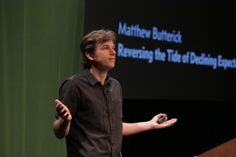
At TYPO Berlin, I talked about the idea that the highest form of design is when designers invest their humanity in the objects they make. That sense of humanity, in turn, gets transmitted to users of those objects. But by characterizing design as a distinctively human communication, I’m also saying that design is a social act. So in my talk at TYPO London, I’ll be investigating that idea further.
Intersecting this idea is the broader historical fact that the printed word is one of the most socially vital inventions of the last thousand years. For those of us involved with type design and typography, I think it’s important to keep at least one finger on that golden thread and its possibilities. But that resolve is tested in any era when printing costs drop rapidly, for instance the last 20 years, during which the Internet has taken printing costs nearly to zero. If designers don’t rise to the occasion, who will?

Matthew Butterick
3. A conference like TYPO London is in itself an obvious example for a social event: what are you especially looking forward to?
As a speaker, TYPO is an event that I wish I could attend a second time purely as an audience member. The TYPO talks are always a great cross-pollination of design thinking with all kinds of other thinking. As designers, we all need to be occasionally reminded how large the domain of design can be.
4. Required reading/watching: What are currently your favorite interesting/beautiful publications, exhibitions, books, movies and/or websites?
I found Joost Grootens’s recent book »I swear I use no art at all« to be completely absorbing. I’m also a huge fan of New York magazine, which I consider the best-written and best-designed American magazine.


