


Jeff Wu is the General Manager of Arphic Technology which has their head office in Taiwan and a branch office in Shanghai. He started his presentation from the history of the Chinese character. From Chinese wood type of 12th century to 16th century’s original of today’s SongTi/MingTi (serif font), he showed the variety of Chinese fonts until today.
Sans serif typefaces have become mainstream on digital devices because of their readability from distance and clarity on screen. In addition, Global font and multiple weight font families are required for the digital application.

We have to think about the Global font and multiple weight font families in China and about what they really mean. Because one weight of Chinese font has over 25.000 characters. If other languages are required for it, characters are increased on it. Over and above, if more weights are needed, this sum will be multiplied by weights.
Development of responsive typefaces
Arphic’s responsive typefaces have not only multiple weights but also several widths and optical size adjustments. While a display font has more space between characters and finer details of strokes, text fonts have fewer space between characters and more robustness of strokes. The optimal font will be changed from device to device in the application. This change must happen as fast as possible without a lot of loading time on different devices. Wu argues that the use of dynamic subsetting fonts (the characters of a font that are actually used are downloaded) and Woff2 format reduces the size of fonts more than 90 percent. Thereby, the size of Chinese fonts is not problematic anymore.
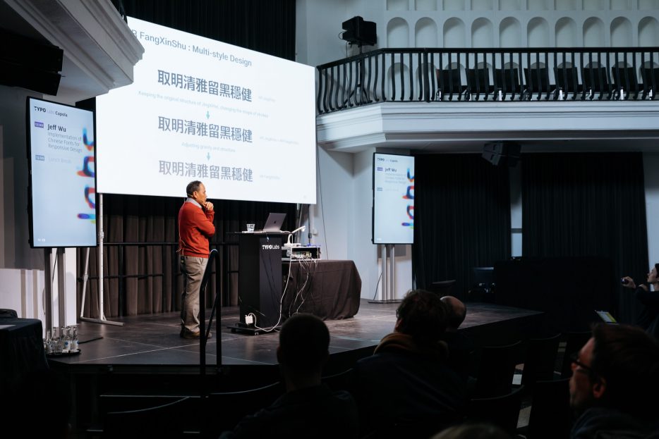
Wu showed the following fonts as an example of responsive typefaces for the high-resolution screen:
– AR UD JingXiHei
– AR FangXinShu
– AR ShuYuanSong
see also http://www.arphic.com.tw/en/font/index
Very interesting type development videos were shown to us. The most interesting thing about Chinese font development is, that it’s using many similar elements to create many different characters. Certainly, “n” can be also be used several times by a Latin alphabet design. But Chinese character development needs more systematic thinking to make so many characters. The elements should be however adjusted per hand by each character to adapt their proportion and form. Please check other videos on youtube channel of Arphic. https://www.youtube.com/channel/UCFvz6gEOTCgiBrfzg8UHv7Q
Wu sais: “I’m looking forward to OpenType variable fonts.”
Future prospects
Although many other Asian foundries are apparently confused with variable fonts whether they can produce them in near future, Wu is already looking forward to seeing the variable font in the application. His company is namely ready to produce variable fonts. Furthermore, he is expecting more collaboration with western font foundries to develop new fonts. I can’t wait for seeing of Arphic’s variable fonts in use in near future!
© Norman Posselt (Monotype)


