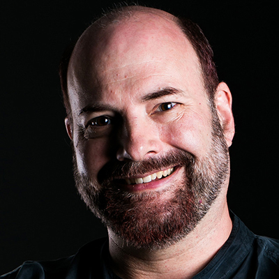
TYPO Talks: What were some of the influences that lead you to your professional focus?
Thomas Phinney: I first started thinking about lettering and typefaces at the age of six; I was confronted with elvish and dwarvish languages, with their own unique writing systems, in The Hobbit and The Lord of The Rings. When I started doing desktop publishing in 1985 I began my serious obsession with fonts.
My focus was intensified in the early 1990s by the writings of Robert Bringhurst (Elements of Typographic Style), Walter Tracy (Letters of Credit) and Alexander Lawson (Anatomy of a Typeface), along with Don Hosek’s short-lived “Serif” magazine. For years I devoured everything I could find about type and fonts. My wife suggested that as I already had about 1300 fonts, perhaps I should try making some. I bought FontLab 2.5 and I was hooked.
As an aspiring type designer and font geek, I wrote to Bringhurst, Hosek and type designer Chuck Bigelow. All of them graciously wrote back, some of them extensively, and I learned that this fascinating field had some generous and kind people at the top of it.
Years later, at Adobe, Robert Slimbach was kind enough to see the seeds of… well, *something* in my Hypatia Sans, and worked with me for years critiquing proofs of the typeface as I gradually refined it into something decent. Unlike some type designers, I started out with pretty nearly no intuitive eye whatsoever for what constituted a well-crafted curve. Concepts, rules and ratios come easily to me, including many kinds of craftsmanship, but aesthetics, beauty and G2 continuity were harder.
TT: How have your creative interests evolved over the span of your career? Or, is there a specific discipline that has always captured your attention?
TP: Type design and the shapes of letters have always been a core interest, but the thing that pulled me into type and kept me in it as a career is that there is so much else to learn that is either integral or at least very closely related to that work: history; technology, Unicode, OpenType; software and software development; user interfaces; business; cognitive psychology, reading and legibility research; legalities, forged documents, and font forensics; teaching and mentoring.
I really love all of it. But typefaces and typography tie it all together.
TT: What’s your preferred environment when it’s time to focus on a project?
TP: Alone in my little home office, with silence and my multi-screen setup! (Note: you may be surprised by how inexpensive 4K monitors have become. Worth a look.)
TT: Which speakers are you most excited to see and meet at TYPO SF Focus?
TP: Going to TYPO SF is like old home day, seeing friends and colleagues and catching up. Ellen, Mark, Sumner, Stephen, Tobias, Erik, Alastair, Nadine… I think I’m missing some! Of the people I don’t know, right now, I’m probably most excited to meet Chip Kidd. But a week before the conference I’ll start learning more about some of the other speakers whose work I don’t know yet.
TT: If you had to choose a favorite place in San Francisco, where would it be? If you’re new to San Francisco, what would you most like to explore?
TP: My favorite place in SF is Golden Gate Park, and my second favorite place is… all the incredible restaurants!
TT: Finally, everyone’s favorite question: what’s your favorite typeface, and why?
TP: I like to use the best tool for the task, and that varies depending on the task. “There is no typeface that is best for everything.” Anybody who says there is, is either mistaken, or trying to sell you something.
That said, one that often comes to mind first when people ask me this is Arno, by Robert Slimbach. I think it hits a sweet spot for being an exceptionally classy Venetian oldstyle without being overly obtrusive. And of course it shows off Robert’s incredible workmanship and skill. I use it for the body text on my C.V.

Thomas Phinney
Typographer / Vice President @ FontLab (Portland, Oregon)
Thomas Phinney presents at 11 a.m. on Friday, May 1 on the TYPO SF Supplementary Track in the Screening Room. Please note this room only holds 100 people and will fill up quickly. All talks in the Screening Room will be recorded and available for attendee viewing following the conference.
Register today to see Thomas Phinney at TYPO San Francisco 2015 – Focus.


