 1. Which work are you particularly proud of? Which work best represents your style or approach?

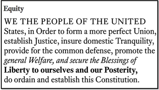
Matthew Butterick’s Equity font
2. What inspires you?
3. The theme of this year’s TYPO Berlin is »Sustain«. Sustainability seems to have evolved into a »buzzword« in the last couple of years, with which agencies and companies aim to fulfill a desire for stability and values. Can you name a project in which this ambition has led to concrete, exemplary design solutions?
»Sustainability« is often used in reference to environmental resources, but it’s equally important to consider the sustainability of ideas. For instance, the fact that most of today’s electronic books have atrocious typography is damaging to typography at large. Therefore, it’s important for those who believe typography matters to help make sure it doesn’t get washed away by declining expectations. This was part of the agenda of my book, Typography for Lawyers: to get readers to raise their expectations. Not just for their own work, but for all the written material they spend time & money on. That, in turn, helps sustain typography.

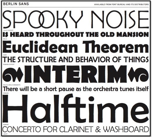
Matthew Butterick’s Berlin Sans font
4. TYPO Berlin 2012: What are you especially looking forward to?
That’s like asking a German surfer what he’s looking forward to in Hawaii.
5. Required reading/watching: What are currently your favorite interesting/beautiful publications, books, movies and/or links?
I found Joost Grootens’s recent book »I swear I use no art at all« to be completely absorbing. I’m also a huge fan of New York magazine, which I consider the best-written and best-designed American magazine.


