


: rebranding Amnesty International (2008)
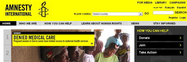
Amnesty’s barbed wire candle and yellow as the colour of hope are the two main graphic elements of the new international corporate identity. Photo: Amnesty.org
Since the early 1960s, Amnesty International has advocated the conservation of human rights. In the first decade of a new globalized century, a new worldwide identity was needed. To set up the project, Marina headed up a week-long creative conference with Amnesty fellows from around the world. This defined guidelines for the new corporate identity establishing that Amnesty should have a highly collaborative style, involving and supporting people from all over the world with a joint concern. The brand needed to address economic, social and cultural human rights with one global voice.

Marina Willer
Since its launch in 2008, almost all of Amnesty’s country units have adopted the global identity Marinas team created. Amnesty in Germany won a D&AD award in 2009 for the adaption of the corporate identity. The unified corporate identity allows Amnesty to join forces for mounting global campaigns. It has attracted millions of additional supporters from all over the world.
: unifying Southbank Centre‘s visual identity (2007)
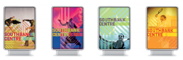
For London’s Southbank Centre, Marina developed an identity system based on geometric shapes to be combined in different pattern. Foto: Wolf Ollins
Built in 1951, the Southbank Centre had a long tradition of connecting arts, due to the four sites it is home to: the Royal Festival Hall, the Purcell Room, the Queen Elizabeth Hall and the Hayward Gallery. With time the visual identity of the centre itself had disintegrated. The four venues had to be reunited and a new approach to their organisation had to be found. Marina’s concept envisaged a new setup of the Southbank Centre: Instead of regarding each site seperately, she suggested to create “a new kind of venue, in which particular arts are not confined to particular buildings, nor performances to a stage or audiences to seats. Instead the whole site is fluid and ever-changing.” The mission was was coined “‘Arts’ new chemistry’ .
The new visual identity followed from the new structures: It centred around the idea of mixing pure singular elements to create an ever new series of outcomes. In partnership with the organisation’s new artistic vision, the new brand is having a transformative effect. The simple and effective identity system is based on geometric shapes to be combined in different pattern. The year following the new brand launch saw a 62% increase in visitor numbers and a 50% increase in income. Today the Southbank Centre is Europe’s largest centre for the arts attracting over three million visitors annually and producing over 1,000 performances of music, dance and literature each year.
: introducing Beeline to Russia (2005)

For beeline in Russia a strong identity was central to succeeding in the mobile communication market. Foto: Wolff Ollins
Approaching saturation, especially in Moscow, the Russian mobile communications market was not an easy place to introduce a new provider for mobile connections . The challenge was to turn Beeline into a brand that was noticed and liked. Beeline’s visual identity had to create long-term customer relationships and deep emotional bonds in a very loud and unstable environment. Marina stated: “(Big cities like) Moscow have a very busy, noisy landscape. Everything is big, and there is a lot of noise pollution. Everyone is shouting their marketing message at the same volume. It really is a very brutal landscape.” A strong identity was central to setting a new standard in the Russian market. Marina developed the new positioning, identity, communications style, image libraries and campaign for launch, involving Beeline and BBDO.
The new branding was tremendously successful with the revenue was up 40% at the end of 2005 . Beeline employed the brand across all communications, packaging, retail, web and headquarter interiors.
: Inventing Tate Modern (2000)
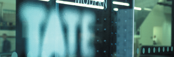
The logos supported the modern approach by moving in and out of focus, suggesting the dynamic nature of Tate – always changing but staying recognisable.
Marina’s most notable achievement is probably the creation of an identity for Tate modern. In the 1990s, the Tate Gallery at Millbank had opened new sites in Liverpool and St Ives. It was also about to create a huge new modern art gallery at Bankside power station in London. Tate wanted to turn all four sites into something new: not a traditional institution, but an exciting destination.
Marina accompanied Tate’s process of reinventing the idea of a gallery – from a single, institutional museum, with a single, institutional view, to a branded collection of experiences, sharing an attitude but offering many different ways of seeing. “Look again, think again is how we articulate what Tate is about.” Marina summarized the main concept behind branding campaign.
The new Tate aimed to become a part of everyday national life, democratising without dumbing down. Marina created the Tate brand as an invitation and a challenge to visitors. The London sites were named Tate Britain and Tate Modern to make clear kind of art they exhibit. The logos supported the modern approach by moving in and out of focus, suggesting the dynamic nature of Tate – always changing but staying recognisable. Tate’s visual style was expressed in its posters, website, publications and shops.
From the day it opened, Tate Modern was a huge success, attracting double its target visitor numbers, and becoming the most popular modern art gallery in the world. After a year, Tate’s overall annual visitor numbers had risen by 87%. The Observer summerised in May 2005: “Tate has changed the way that Britain sees art, and the way the world sees Britain.” In March 2011 the Tate logo has been voted one of the best logos of all time by UK design bible, Creative Review. The logo entered Creative Review’s chart at number six above Apple & the Rolling Stones.
The detailed story of Tate modern can be viewed a BBC Culture Show Special on ten years Tate Modern.
: Short Movies

Still from Cartas da Mãe (2003), a chronicle of Brazil in the last 30 years, told through the letters that the cartoonist Henfil (1944/1988) wrote to his mother.
Besides her visual communication works, Marina creates and directs independent short films. Her short movies, Cartas da Mãe (2003) and Richard Rogers Retrospective (2007) have been shown at the ICA in London, Cartier Foundation in Paris and various prestigious film festivals like Rotterdam or Clermont Ferrand Film Festivals. She is an external examiner at the Royal College of Art and has been a jury member of the D&AD Awards 4 times.
In 2000 she was nominated for the Selfridges/Perrier award for The Best British Designer. In the same year, Marina won a silver medal in the Promex award for Best British Promotional film for a TV Channel. She also won best Brazilian short film in Sao Paulo Film Festival, 2004.
At TYPO London 2011 Marina will show us how professional branding facilitates success. Glimpse into her bag of tricks for the creation of visual identity!


