Travis Kochel is a partner at Scribble Tone, a design studio based in Portland, Oregon. Their work explores intersections of typeface design, interactive experiences and branding. They are creators of FF Chartwell, a set of fonts to create simple graphs within text boxes. Published by FontFont in 2012, it has received awards and accolades from Fast Company, Communication Arts, Typographica, and ATypI. Travis graduated with a BFA from the School of the Art Institute of Chicago in 2008. He currently teaches Typography, Typeface Design, and Interactive Design at Portland State University.
TYPO Talks: What inspires you?
Travis Kochel: Volcanoes, deserts, passionate people, type specimens and frustrating tasks—also known as opportunities.TT: The theme of this year’s TYPO is Contrast. Can you give us an example of projects in your portfolio that contrast with one another? Or a project that contrasts with itself?
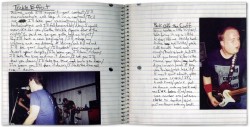
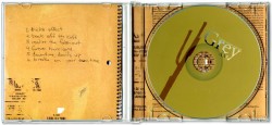
TK: My first explorations in design showcased an unflinching desire to create compositions created entirely by scanning textures, handwriting and photographs. Flat colors and digital type were not an option, regardless of the client or project. One of the few examples of this era of my work that I can look at without cringing, is this album art for the Grey AM.
The site we—Scribble Tone—created for Design Week Portland could not be further from this approach. The site only features one image at the very beginning. While it does a good job of getting things started, the real show is the huge type and subtle interactions as you engage the information below. You could say this is a result of an irrational fear of imagery. I think we’ve just learned to embrace the efficiency of type as image, and tried to stay more true to the medium.TT: What other speakers at TYPO San Francisco are you most looking forward to?
TK: It’s difficult to select just a few, but I’ve always admired Peter Biľak’s work. His perspective of exploring and reaching across many fields of design should be interesting. Stephen Coles and Erik Spiekermann, among many others, should be great as well.Travis Kochel
Travis Kochel is a partner at Scribble Tone, a design studio based in Portland, Oregon. Their work explores intersections of typeface design, interactive experiences and branding. They are creators of FF Chartwell, a set of fonts to create simple graphs within text boxes. Published by FontFont in 2012, it has received awards and accolades from Fast Company, Communication Arts, Typographica, and ATypI. Travis graduated with a BFA from the School of the Art Institute of Chicago in 2008. He currently teaches Typography, Typeface Design, and Interactive Design at Portland State University.TT:What is your favorite thing to do in San Francisco?
TK: Embarrassingly, I have never been to San Francisco! I imagine it will involve burritos or pizza though.TT: What are currently your favorite interesting/beautiful publications, books, movies and/or links?
TK: In just 2 issues, Codex has delivered with very in-depth articles on type, in addition to being beautifully laid out. I also just got ahold of some reproductions of the old Hamilton wood type catalogs, and have been spending a lot of time with those.TT: What does “contrast” mean to you?
TK: Contrast can be subtle.Get your ticket to see Travis and all of our other excellent speakers here.


