


Chip takes us through some anecdotes of his experiences as a book designer, going right back to his first day at college. He remembers his teacher showing him a picture of an apple with the word ‘apple’ written underneath. The teacher covers the picture only and says “you show this”, then proceeds to only cover the word ‘apple’, “or this, but never both”. His point being, you don’t need to treat your audience like idiots and show both. You should show or tell.
This lesson came into practice when he had to design book covers for biographies of two very famous, glamorous women. One was Katherine Hepburn, which he considered she was about ‘language’, so he chose to ‘tell’ using typography. This contrasted with Marlene Dietrich, who was all about the image, here he chose to ’show’, with no typography at all on the cover, just one iconic image.
Arguably his most famous design is the iconic black skeleton from Jurassic Park. Originally designed for the book cover, he explained his process of going to a local library, photocopying and tracing the skeleton, all in a very slow voice for the benefit of the large young proportion of the audience. He apologises for the typography on the original cover, but when showing how the film company adopted it, and used “even shittier typography” he didn’t feel so bad.
He talked about failure too, something that designers rarely admit too, especially when a client rejects everything you’ve put forward and hire someone else. He showed the rejects, the painful process of starting again, getting desperate, of course a huge dash of self-efacement and humour. Even someone as successful as Chip Kidd still has problems getting ideas accepted, especially when up against an unadventurous marketing department.
One key example is Augusten Burroughs’ ‘You Better Not Cry’, which were a collection of tragic, dark Christmas stories. This author had been thrilled by previous work Kidd had produced for him, but somehow the ideas put forward for this book didn’t stick.
He began with a scared looking porcelain figurine woman, which wasn’t quite right. Then he tried a porcelain Santa with a sack full of guns standing in front of her – they were worried he was showing her his penis (the guns were fine). He finally tried pets dressed in humiliating outfits. After weeks he finally got a call saying “We solved it in house”. Instead what they got was this:
Part Two dealt with his fanboy dream to design a completely new Batman comic. He demonstrated his lifelong love of this character by showing an old family photo of him dressed as Robin, his brother as Batman, and his mother as ‘Batmom’. “Thanks Batmom” he said with a stern face. He admits, just because he dreamed about such an opportunity all his life, didn’t actually mean he’d thought about how he was going to do it. “Be careful what you wish for”, he warns.

Chip Kidd
Writer / Graphic Designer (New York, New York)
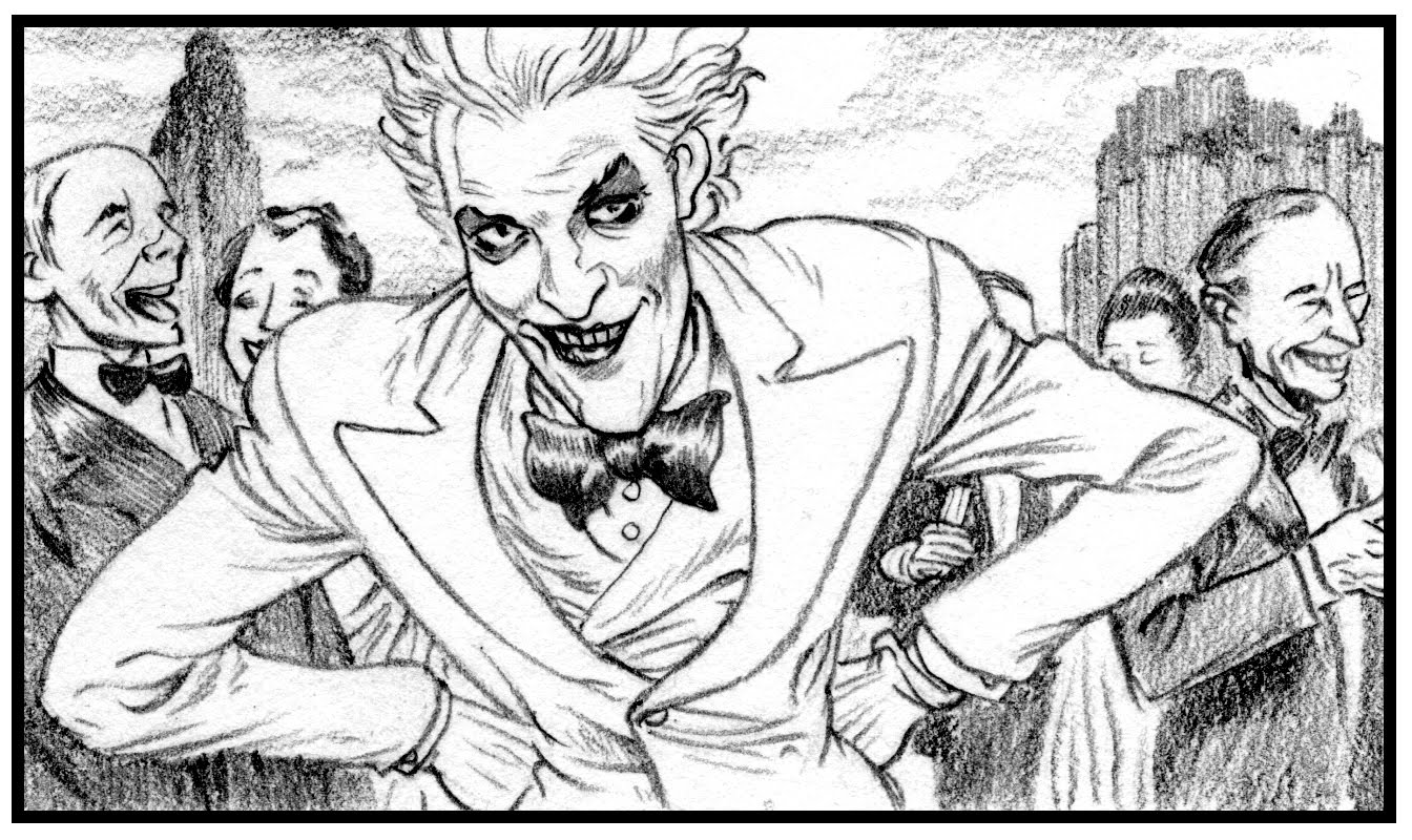
He started, naturally from a design perspective and New York which is such an important backdrop to the character. His starting point the title ‘Death by Design’. He took it back to the early days of the comic’s history, and imagined how a big blockbuster in the 1930s would visualise it, citing Fritz Lang as a big influence. Teaming up with Dave Taylor, an astonishingly talented British comic book artist they devised a style (stripping back to a simpler costume), introducing new characters (a love interest and a new villain – an architectural critic). He had a chance to play out his fantasies, one of which was a giant glass nightclub balanced on top of four skyscrapers. We got to see the first quarter of the comic, before we left us with a cliff hanger, and an evil Joker laugh. Chip Kidd was a natural showman, and knew how to work a crowd. But what I enjoyed particularly which is sometime missing from these design presentations was the back room detail, the failures, the frustrations and ultimately the solution. Seeing the first shaky ideas for a project, actually makes me appreciate the final project, than simply the last pretty picture. Thank you Chipp, for a fine end to the conference.
The projects I’ve shown here, haven’t really shown off Chip Kidd’s talents, I went for anecdotal over design style, but see a taste of his prolific output here at the Book Cover Archive.
Text: Ian Moore, Design Asembly


Pingback: Fontblog | TYPO London 2011 im Rückblick