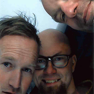
Akiem Helmling, Bas Jacobs, Sami Kortemäki want to question if the web is the right place to consume and archive information. What seems to be quite a paradox idea – mixing the analogue and digital worlds – is exactly how they believe a designer should relate to typography.
Reading on the web isn’t the most comfortable task and web typography still can’t really compete with the qualities of printed matter. Concerning the aspect of information in general, there is the following to keep in mind: The web is constantly changing. Every piece of information can disappear in a second and a user can never be sure if the content (or even a version of it) is accessible in the future.Underware’s newspaper can be seen as a specimen of the typeface »Zeitung«, a type family well functioning in small sizes on screens. Using the web typeface for a publication about web typography, printed on paper, closes the circle of this paradox.

Underware
Type Foundry (Den Haag / Amsterdam / Helsinki)
The type designers from Underware think these are interesting times for type designers. They wonder how variable fonts can be. They wonder what it means that their fonts will outlive them. They wonder how many dimensions a font can have. They wonder what this all means for type designers now, and in the future. And meanwhile they steadily continue to make new typefaces for their independent type foundry at www.underware.nl


 © Sebastian Weiß / Monotype


