


We don’t have interpolation available at a font level since 16 years, when Adobe’s M(ultiple) M(aster) format was taken out of the OT specification. But now things are changing quickly and designers will soon be able to use the new capabilities offered by variable fonts to solve a number of old problems. Designer could trigger smart interpolation action directly during characters composition.
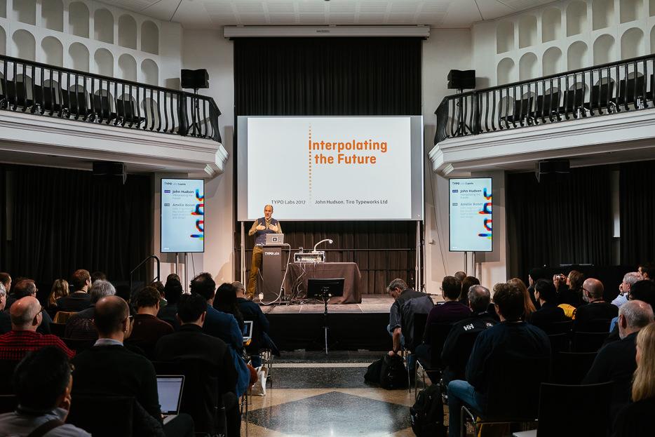
Opening the final conference day John Hudson presented a series of variable font examples, some of which are already under consideration as extensions to the existing variable font technology. Photo: Norman Posselt
The first proposal is related to interpolatable components. The basic idea is trying to inject into the variable fonts specific design spaces (subordinated to the main design space) which will tackle just one composition issue. Adapting diacritics in Latin, building glyphs in CJK, complex components construction in Tibetan script. The list of course could be longer. The size of fonts could be substantially reduced and glyphs could be smartly built at the composition phase.
But this can be expanded even further. For example Matra character from Devanagari script should adapt according to the context of use. This issue is often solved with OT substitution features, but the amount of duplicates that have to be created into the font is very high. Triggering the visualization of a glyph variation according to OT features would solve this issue in a compact and elegant way. In order to make this happen, rendering engines have to be updated and accept this kind of feature.
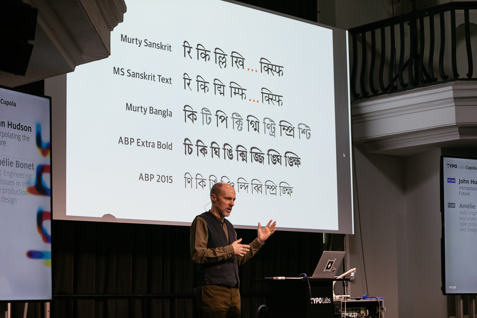
The audience followed a series of applications for variable fonts, such as improvements to efficiency of CJK glyph storage, complex script shaping, justification, and mathematical typesetting. Photo: Norman Posselt
Math fonts could also benefit substantially from Variable Fonts. In order to form an equation, glyphs have to be stacked on multiple layers. Parenthesis, brackets and braces have to adjust to such height. And many symbols and letters need to be adapted in order to fit a specific composition size: x-height, superscript and subscripts, subscripts of subscripts and so on. This issue pushed the scientific world many years ago to shift towards composition system based on MetaFont and LaTeX because of the parametric features included.
Will VariableFont let designer inject more typography into their fonts?
There is definitely more to explore than just pack old MM font into the new notion of design space.


