


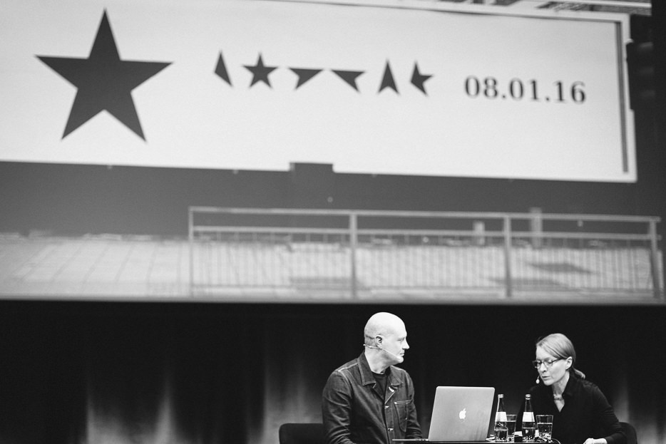
Jonathan Barnbrook on the TYPO main stage in a conversation with Sonja Knecht © Norman Posselt / Monotype
All Design is Political
What a pleasure to listen to someone who actually has something to say. In an industry that is so much about surfaces, many times so specialized that it seems far removed from real world problems and by default committed to the market economy, it is so good to hear someone who thinks in polical categories and treats graphic design as a relevant and powerful tool to actually make the world a better place.
From his very early punk days, Barnbrook took the idea to change society through pop culture. He considers graphic design a valuable cultural ressource and uses it to address issues in society, such as the politics of the Olympic games in London. Typography to Barnbrook is charged with political responsibility and he experiments with letterforms to make statements about language and its political dimension. Fonts like his famous „Mason“, „Tomahawk“ or „Tourette“ aren’t big sellers at his foundry Virus fonts, but they serve to stir discussions and even provoke letters of protests from the public.
Does it really matter to create a piece of graphic design? Jonathan Barnbrook does not claim to have an answer. But he speaks quoteworthy even in a casual conversation like the one he had with Sonja Knecht on stage this year, so here are a few representative snippets as a teaser to go and watch the video of the entire talk.
“Making the world more beautiful is making the world a better place, and that’s the idea of political utopia.”
“How do you create attention? How do you shock? Forget about that. You have to do good work.”
“The concept of pictograms is a white middle class concept – sorry to say that.”
“I live next to the cemetery that has Karl Marx in it – it’s the only cemetery in London where you have to pay to get in.”

Getting along well: Jonathan Barnbrook and Sonja Knecht © Norman Posselt / Monotype


