


Michael Hochleitner and Anna Fahrmaier present their font Ingeborg © Sebastian Weiß (Monotype)
With their joint expertise in type design and graphic design, lettering and illustration, the Typejockeys are all about Schrift. They release their own well-crafted and award-winning fonts and they are amazed by the myriad of ways people use them in contexts completely different from the ones they were intended for.
The original Typejockeys Anna Fahrmaier, Thomas Gabriel and Michael Hochleitner (recently Stefan Kirsch joined the Typejockey team) have been friends since they were 14 years old. When they went and studied together at the “Graphische” in Vienna, they realized that they were not only friends but also worked well together as a design team.
After graduation they went their separate ways for a while. Michael saw the world in Reading, Thomas in Den Haag and Anna in Düsseldorf. Back in Vienna and still “naive but determined”, they founded Typejockeys in 2008 and have been all about Schrift ever since.
The Typejockeys work for clients ranging from car washes to high-end vineyards, yet they are not pretentious about being one of the most interesting design studios in Vienna. In their talk at TYPO Berlin, they don’t go on about how much fun they have or how unconventional and creative they are or how cool their clients. Instead, they show real life, like the countless variants that precede the final version of a logo. And they talk about long process of sketching, digitizing, editing, improving, looking at printouts, and editing, and editing, and editing that goes into making the kind of fonts they make.
The first three fonts they released were based on their final projects. For example, the angular Prémiera Thomas Gabriel’s MA project from the Type and Media course at KABK in Den Haag. It is optimized for very small sizes but of course designers go and do what ever they want with it, so there are examples of the font being used for a movie poster, for packaging and even in a very large size on TV.

Typejockeys
Font Designer, Graphic Designer (Vienna)
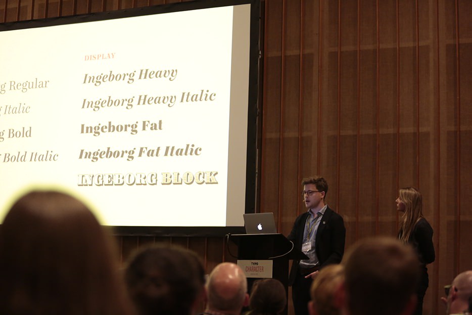
Michael Hochleitner designed his font family Ingeborg as a final project for the type design M.A. at the University of Reading. Ingeborg is a readable Didone that owes a lot to the English fat faces, and it is popular: German design magazine PAGE uses Ingeborg for headlines, Friedrich Forssman designed a whole series of books with it.
To counterbalance the seriousness of all those endless rounds of editing and tweaking, the Typejockeys recently started their label “Typejockey Shots” for more playful font projects. The Shots are often display fonts that don’t come with a large number of styles, many of them a side product of custom typography done for clients and expanded into a proper font.
In the meantime, Aniuk and Henriette have been added to the portfolio – a display font and a font based on old Viennese street signs. And Typejockeys’ most recent release Vito, is what kept Thomas Gabriel from coming to TYPO for the talk. Vito is their first sans serif, it has 60 different styles. TYPO participants had a beautiful specimen book in their conference bag and everyone else should go check it out online.
Call for action: Buy Vito now and be an early adopter, it will be a sought-after staple font soon.
AR


