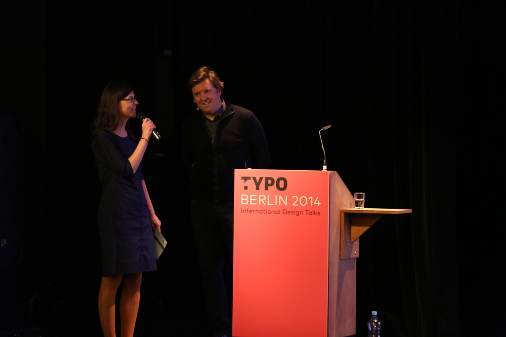
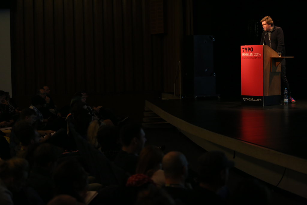
He began with leading us into the roots of why he designs for architecture. Despite, once designing a door handle with braille on it, he’s never quite been an architect. And despite hating working with architects because “they are also designers,” Grootens’ studio produces the majority of its work for architectural academic and research books.
Not being an architect beneficially allows Grootens to present this information about architecture in new and interesting ways, that reflect the nature of the buildings in book form.
He gave three very different examples of books style mirroring the styles of architectural firms. For a book on Japanese architecture firm SAANA, Grootens utilized double imagery and very little text to represent the non-hierarchy in the buildings and to “capture the essence of SAANA’s style.” Conversely, he highlighted a book on Peter Zumthor with a tactile cover and “filmic sequence” layout which visually complemented the “I” statements in the text. Finally, he shared a book for MDRV integrating a social aspect of the buildings with photos from users and social media as well as professionals.
After sharing his foundation in architecture, Grootens talked more about his fascination with atlases and indexes as an ideal visual format, using the palette of means to convey information (from maps to photos to data). In a fast-paced technological society, it’s critical to “take information out of the flux and study it,” he said.
Grootens then walked the audience through the 26 month journey to create a collections book for Museum Boijmans Van Beuningen in Rotterdam. Indexing an art collection was a mix of database management and hand-tweaking. The possibilities for conveying information were endless, from chronological by creation date to collection date, to maps by artist origin. “It’s all about the thinking and rethinking of what you can do with information,” he emphasized.Finally, Grootens left us with a teaser of his new typeface for indexing – Ceremony – coming out in June 2014. Developed for numbers initially, the typeface encompasses an array of alphanumeric glyphs as well as symbols. News on it can be found at Optimo.ch.


 photo © Sebastian Weiß


