


Of course, these are tools and as with every craft, tools on their own mean nothing if they’re not deployed in the appropriate process. So, as with many other talks in TYPO, the Scrum methodology principles of putting interdisciplinary teams working together on an incremental part of the project, made their appearance in these slides too. A slide of a typical waterfall process of a designer handing designs to a front end developer, handing work to a back end developer, handing work to an editor, accompanied by the rhetorical question “where does responsive design fit in all this?” illustrated the point that the process of creating a digital product requires involvement of more than one principles at the same time.
A little more technical slides followed, like creating smarter urls and taking care of performance issues in mobile, before my and, possibly most of the audience’s favourite part came. In this, to emphasise the importance of performance tweaking, Vitaly made an experiment of how much it would cost him to download an assets-heavy website, in a foreign country, using a mobile carrier’s roaming charges. A (maybe not) surprising example of vogue.co.uk leading to a 93€ charge in megabytes and data fees raised some laughs, but also concerns from a lot of the front end developers among the crowd.
As with every self respected responsive presentation, the Guardian website was referenced as a great example of a mobile-first website (it is!), from their stealth mobile relaunch strategy to lazy loading their assets to give priority to content. Some impressive performance benchmarks followed, but despite the talker’s double attempts to draw the needed awe sounds from the crowd most of them stared at the stacked books in front of him, probably wondering if they would be thrown upon them too.

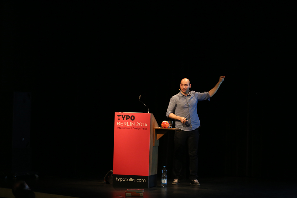
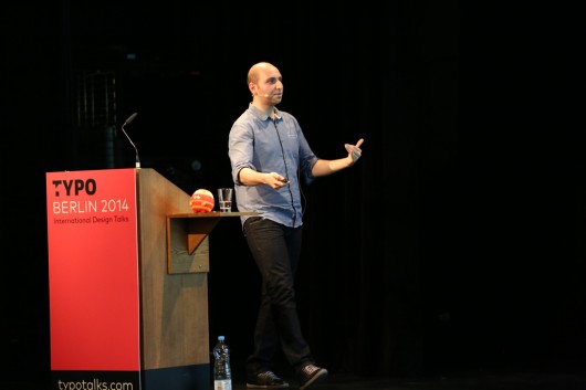
Vitaly Friedman
Editor-in-chief / Smashing Magazine (Freiburg)
As the long talk was way overdue, the closing slide picturing the Voyager Golden Record was a bit rushed through, however the metaphor of creating performant, sustainable websites that would last five or ten years (which equal to an eternity in web years) was clear, understandable and to the point.
Text — Spiros Martzoukos


