Move from Regular to Bold, not from Regular to Medium!
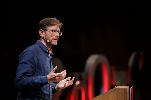
“Almost Boring” is the way Fraser Muggenridge describes his early work. Almost boring, that means: Very consistent, very formal, very clean — with only a minor detail that the whole typography relies on to be interesting.
“Almost boring“ Also means: Don’t go crazy. Fraser shows a couple of posters he designed and printed with a Letraset: It’s not the arrangement or variety of fonts used that make the layout interesting, but the imperfection of the printing itself.
Text As Image As Text: Letters are sculptures!
Over the years, this imperfection has become one of Fraser’s bigger passions. His experiments with typography, distortion and letter-bending ended up in a process of image-making: Strong concepts are accompanied by almost sculptured typography. It was not about designing letters anymore, but creating them through mistakes, algorithms and conceptual distortion.
Making symbols, strange juxtapositions; moving on and away from Nearly Boring was what it was all about.
If we take a look at the aesthetics of the New Rave movement in pop culture—psychedelic visuals, neon colours, flashing lights and an anarchic energy — we are pretty close to Fraser’s recent projects. With his project “Mega Font”, he experimented with subtle typographic errors: Mixing letters from Times New Roman with Bookman, aligning a typeface by it’s x-height, generating a slight wonkiness which generally is invisible, but hurts the typographer’s eye: This is New Rave. “It’s all about the subtlety”, as Fraser sums it up.
That space before the comma is intentional!
His personal development is best described as “being really mono to being really lairy”. The mistakes you can find in Fraser’s designs all of sudden become incredibly charming, once you realized that breaking rules is fun: “New Rave means everything is possible. You are allowed to do whatever you want to do—It is very expressive.” The first slide he showed us in the beginning; a very tidy, very tame layout of a book page he created a couple of years ago, now compared to his more recent work: “Sooo ravvvy”.
See Fraser Muggeridge’s recent projects at pleasedonotbend.co.uk.


 © Gerhard Kassner


