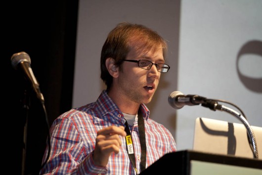
David eagerly jumps into his talk on reverse contrast fonts which he feels are “woefully underused”. He feels that they are much more significant and has more to offer than so-called gun slingers. To give a brief overview of the terminology that David would continue to use throughout his talk, he introduced “normal contrast” and “stress” which is very beneficial for a person who has an elementary view on the topic of typography.
As the talk continues, he emphasizes the history of various reverse contrast fonts from the 19th century and displays the evolution that these typefaces have taken to the current day. He digs into four groups that make these fonts notable: concept, texture, funkiness, and dynamism. David incorporates the theme of TYPO into his talk by stating that the “sense of rhythm that foreshadows where the typeface is going.”His enthusiasm for reverse contrast fonts is shown throughout the talk and passionately concluded with what he feels reverse stress offers: a parallel universe.

David Jonathan Ross
Type Designer (Los Angeles)
David Jonathan Ross draws letters of all shapes and sizes for custom and retail typeface designs. He joined The Font Bureau in 2007, and his typefaces include Manicotti and Trilby, reversed stress slabs; Condor, a high contrast sans; Turnip, a rugged bookface; and Input, an extensive family designed for computer programming. David often shares his love of letters through lectures and workshops, and curates Retro Script L.A., a collection of cursive signage in his home town of Los Angeles.
Text — Noelle Germone — @ngermone


