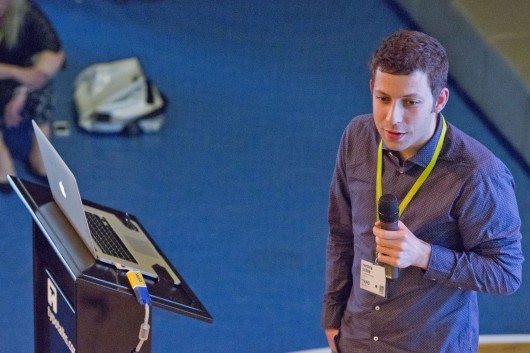
Henning guides us through the re-launch of Süddeutsche Zeitung, art directed by Christian Tönsmann, where his part was to design a new SZ typeface. Today the world of newspaper is a hart business, no one can really afford to loose a single reader. It was essential for the project to design an evolution instead of a revolution.
The newspaper as a flexible but complex document that requires a typographic treatment with an answer to every detail. The font Excelsior, previously used in SZ was not flexible enough to react flexible. The idea to use Miller instead as a calmer typeface with the same roots, but with more typographic detail ended in the test phase: the value of grey (Grauwert), was too different.
By creating a new type face, all required details could be answered like a tailored suit.
Henning created the SZ text with less wide majuscules, more open counters. He added a serif headline font to the SZ text font, where more expressive details could be implemented. The numerals in his font he describes as a hybrid of medieval and aligning numerals.Analysing a page in detail you have 17 different formats of the SZ family on a square of 10×10 cm. Astonishing but they all work together as a team.

Henning Skibbe
To end his talk Henning shows us an alternative solution to create the same flexibility as creating a customised font. For Stern the font Benton Sans was used in the magazine throughout. In Hennings words: “Benton Sans is solid but not really packed with emotional character.” For the re-design Henning combined a set of four typefaces to give each article a different voice and a different face that also communicates a different emotional connotation.
Well done Henning for making such a specialised topic transparent to the audience.
Sandra / GraphicBirdWatching


 Henning Skibbe, Foto © Alex Blumhoff


