


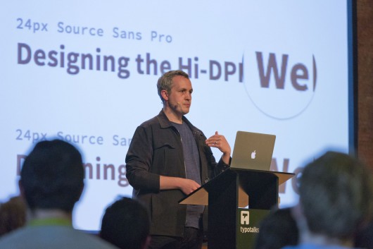 David Demaree © A. Blumhoff
Later on, the web became print’s natural successor and the first ever website created by CERN (an artefact that has recently been re-published) was done so with the notion of defining a ‘better printed page’. David explained that you should consider the web to be a physical medium: images have dimensions, files have weight and networks have bandwidth.
He pointed out that with hindsight, the early years of the web were perhaps misguided; not using the web as an object of information (with pictures for decoration), but merely using it to send raster images of text. We also eventually arrived at a set of assumptions, creating an industry ‘platform standard’ or reference point e.g. a stationary desktop computer, broadband or wireless, 72dpi with millions of colours and a 1024 x 768 display.
These assumed constraints allowed designers to stay where most people felt comfortable, using a more traditional print-based process creating static visual page designs at a fixed size. Designers for the web were also making conscious decisions of richness versus reach; using things like image slices, sprites or even Flash to get things to look just how they wanted at the expense of actual text content and accessibility.

David stated that even though technology has progressed, the conventions used when designing for the web still often remain in print.
This is something that is now having to change – David says – by needing to design for a whole new range of outcomes. Web content is now consumed in different physical contexts from where it was created. Our assumptions of a platform standard have become invalid (did we ever really know in the first place?). The web has fragmented with things TVs, Games Consoles or Car Dashboards all now capable of displaying web content.
David explained it’s more than just different screens though, it’s different contexts and technological considerations. Not only could mobile data connections be slower, physical factors also come into play. Are we in a tunnel, is the building we are in built from a certain material, how far are we from the cellular tower? Data is a limited resource and in some cases very costly. Screens have varying resolutions and DPIs and the question was posed… will DPI overtake connection speed? Development of mobile phone technology can occur more rapidly than that of cellular towers.

David Demaree
The bottom line: we simply can’t assume things anymore, and need to design responsibly. It is the designer’s job to aid the spread of information.
So how can we do this? David summed up a few of his thoughts, urging us to embrace interactivity and design for the web as a user interface or body of information as opposed to a set of pages. Also to remember that we are delivering a set of instructions for how a browser should render information on screen, rather than delivering the rendered work itself.
Naturally embracing Responsive Web Design was at the heart of his recommendations, advising the audience to think in proportions for layout and type, not fixed widths, pixels or pages. Considering technical implementations like DPI media queries and Adaptive Content can also lead to a better experience. Finally, to look at all of the variables of modern web design not as problems, but opportunities for embracing the web as a platform for information which is constantly adapting.
Text — Matt Berridge — Front End Developer for Edenspiekermann — @mattberridge


