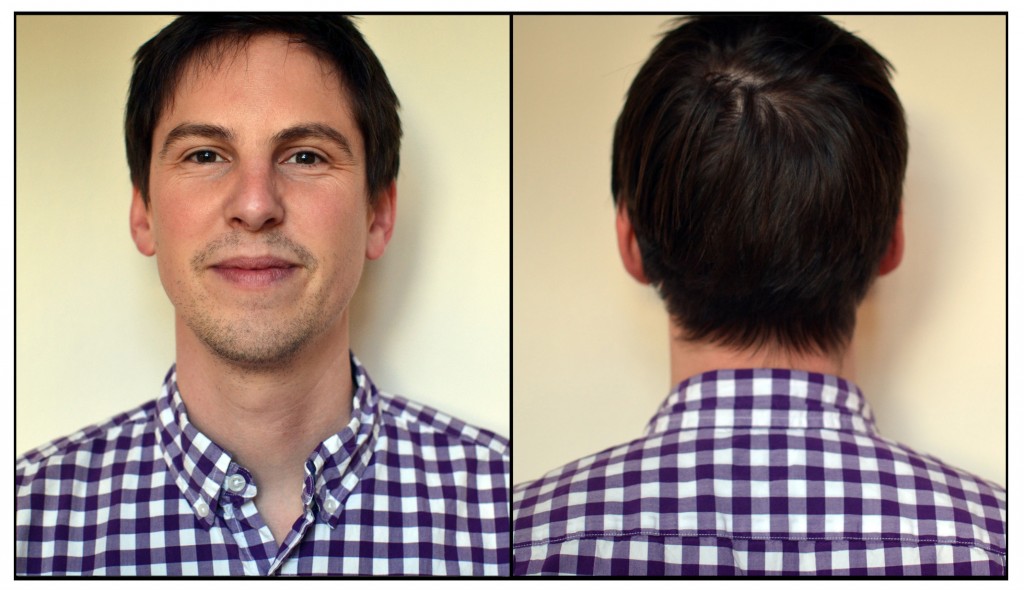
Tom Manning is a Principal Designer at Frog’s San Francisco studio. He has art directed such magazines as Filter, Mean, and Frog’s design mind, and previously worked with IDEO, McCann Erickson, Harper Collins, and Little Brown publishing. Manning is also a comic book creator, writing and illustrating the critically acclaimed series Runoff. Manning has a BFA in Art History and the Visual Arts from Occidental College and an MFA in Graphic Design from the Yale School of Art.
TYPO Talks: What inspires you?
Tom Manning: Things that have been made with a lot of consideration. That could translate into a high level of craft, or a well executed long form narrative. What inspires me is when I’m experiencing a film, a song, a piece of art, or design that is not only beautiful in it’s execution, but considered.TT: The theme of this year’s TYPO is Contrast. Can you give us an example of projects in your portfolio that contrast with one another? Or a project that contrasts with itself?
TM: What comes to mind is a book I did in called Spam Collaborations. Like anyone else with an email account, every day I am greeted with a fresh dose of spam. Because spam filters are designed to scan emails for certain words and phrases, spammers have created programs that automatically generate a text that looks “normal” enough to get into our inboxes. The resulting messages are a strange blend of meaning and nonsense.
Every day for two and a half weeks, I decided to create a comic strip based on a spam text I received that day. My anonymous and presumably automated collaborators supplied the words. I figured out how those words might translate into a daily strip. The email subject line provided the title of the comic, and the author’s name was that given by the spammer. The result is a modern kind of surrealism that is hard to imagine without the strange magic of today’s technology.Tom Manning
Tom Manning is a Principal Designer at Frog’s San Francisco studio. He has art directed such magazines as Filter, Mean, and Frog’s design mind, and previously worked with IDEO, McCann Erickson, Harper Collins, and Little Brown publishing. Manning is also a comic book creator, writing and illustrating the critically acclaimed series Runoff. Manning has a BFA in Art History and the Visual Arts from Occidental College and an MFA in Graphic Design from the Yale School of Art.TT: What other speakers at TYPO San Francisco are you most looking forward to?
TM: Jens Gehlhaar for sure – that is one smart, smart man. He is a visionary in motion graphics, but also an incredibly talented typographer, print designer, and type designer. I’m also looking forward to Armin Vit and Erik Spikermann.TT: What is your favorite thing to do in San Francisco?
TM: My favorite thing is to escape it, actually. San Francisco is surrounded by some of my favorite natural places in the country: Marin to the North, Yosemite to the East, Big Sur to the South, and surfing in the Pacific ocean to the West. But if I had to stay in the city, I really enjoy going to the Legion of Honor museum. I love the collection, and the spot is just beautiful.TT: What are currently your favorite interesting/beautiful publications, books, movies and/or links?
TM: Publications I’ve recently enjoyed: Wax Magazine, Uncorporate Identity by Metahaven, Graphic Design: Now in Production, The Art of Daniel Clowes: Modern Cartoonist.TT: What does “contrast” mean to you?
TM: Contrast creates clarity.
Get your ticket to see Tom and all of our other excellent speakers here.


