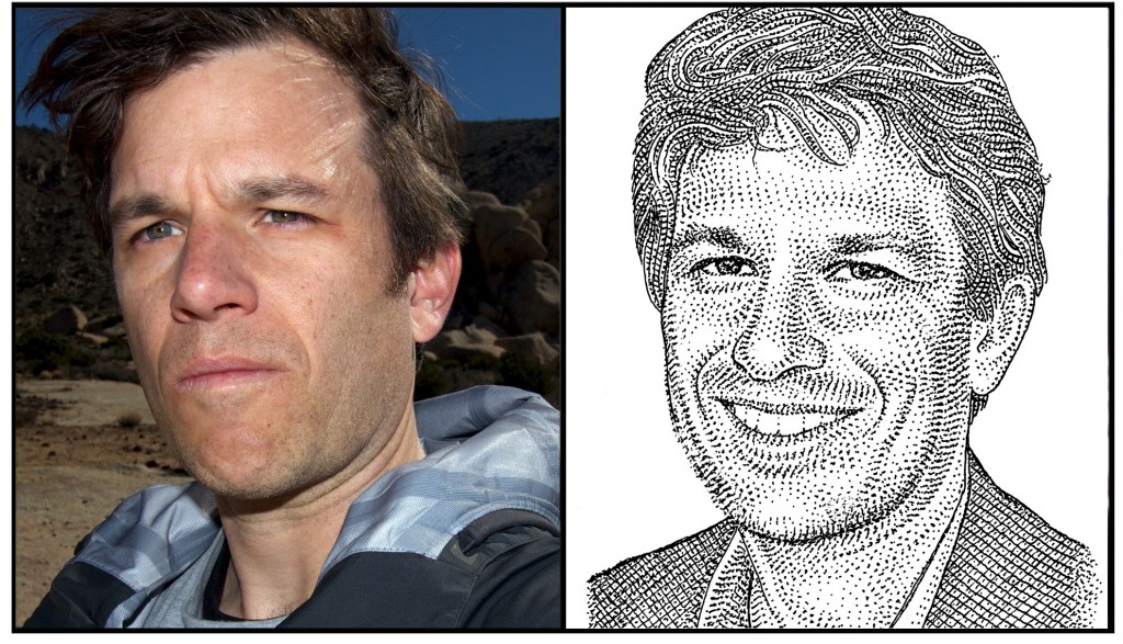
teaser-box align=”left” width=”60%”]

[/teaser-box]
TYPO Talks: What inspires you?
Matthew Butterick: I love how the ecosystem of individual creators pursuing technology ideas just gets bigger, more diverse, and more influential every year. We’ve all been watching this shift for 15 years. So in one sense it’s not surprising. But what has surprised me is how the technology industry has gotten increasingly disconnnected from that ecosystem. Startups are more boring than ever, because truly talented creators neither want nor need that overhead. After decades of disrupting every other industry, the technology industry finally disrupted itself.
TT: The theme of this year’s TYPO is Contrast. Can you give us an example of projects in your portfolio that contrast with one another? Or a project that contrasts with itself?
MB: I feel like I’m in an ongoing project to provide contrasting conditions for my own thinking. I started my career in design. After about nine years, I stopped. Then for the next seven years, I did completely different things — music, law. Then I came back to design. And my approach to it the second time is very different. I like that. I’m sure if I’d been doing design all the way through, I would’ve been more likely to repeat myself.
MB: Haven’t decided yet. But I like to see speakers who are doing a better job than I am pursuing the purest version of their own ideas. Also those who are curious about design culture and ethics. Also those who are apt to have strong, well-informed opinions. Usually this means that I see the speakers who are at the farthest remove from global branding solutions.

Matthew Butterick
TT: What is your favorite thing to do in San Francisco?
MB: Riding my bicycle far enough that I can justify eating a grilled-chicken burrito at Taqueria La Cumbre. I had to miss the official TYPO London bike ride in October, so I’ll be lobbying to arrange one for TYPO SF.
TT: What are currently your favorite interesting/beautiful publications, books, movies and/or links?
MB: Garner’s Modern American Usage. Zero Dark Thirty. James Pogue’s Diary of Mad Fact-Checker. John Teti’s takedown of the new Sony PS4. The Elements of Computing Systems. Dan Neil’s car reviews in the Wall Street Journal. German type specimens from 1900 to 1960 — please send more.
TT: What does “contrast” mean to you?
MB: Contrast conveniently contradicts consensus.
Get your ticket to see Matthew and all of our other excellent speakers here.


