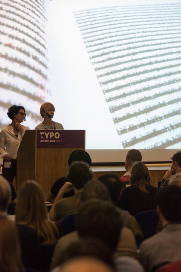
Over the next 40 minutes, Gerber and Iversen showed the TYPO audience how they’ve married design and literature to create, as their strapline states, “great looking stories” in an “chaotic, oftentimes frustrating process, but that’s where the magic comes in.”
Publishing house Visual Editions is four books old. Bursting into life in Winter 2010, with an APFEL-designed “punked up” version of British classic Tristram Shandy, they introduced a unique approach of producing a shared experience for different types of audiences and instigating conversations about how you read. Simultaneous exhibitions of the book at both the Design Museum and Shandy Hall on the same day underscored this juxtaposition.
In the end, Visual Editions aims to “champion visual storytelling no matter what the platform.” Whether it’s a die-cut book full of holes (Tree of Codes) or a fold out text of digressions (Kapow!), the drive “to create affordable cultural objects and different reading experiences” is at the firm’s core.
True to the theme of this year’s conference, Visual Editions truly brings Social to the reading experience. They strive “to get people talking about a different way of reading” and love getting emails about where people read (the bath) or even reader frustrations (“How the hell do you read this shit?). For their third book, Composition No. 1 (or “book in a box”) they held a mass reading event at the V&A with 150 “read out louders” stationed around the museum from everywhere to quiet exhibit halls, to the lobby, to the loo and each attendee could pick their own experience of hearing the story. Engaging their readers is a top priority for the firm and they involve readers throughout the entire experience of creation.They’re also “social” in playing matchmaker between designers and authors. “It’s never about bringing together those who are the same, you wouldn’t get anything interesting out of it,” they stress. The production process is truly chicken and egg, and no one, publishers, authors, designers or readers, know what’s going to happen next. They work with authors that appreciate that design is involved in an early stage, such as Jonathan Safron Foer who adapted his favorite book The Street of Crocodiles by Bruno Schulz into The Tree of Codes, dictated by the die-cut in the design by Sara de Bondt. Similarly, Kapow! author Adam Thirlwell used the Studio Frith design mockups to inspire, inform his story.
“Above and beyond the making, it’s about being inclusive,” says the Visual Editions team. “It’s people coming together around stories in a different way.”
Social storytelling. A great way to commence TYPO London 2012.

Anna Gerber & Britt Iversen (Visual Editions)
– By Meghan Arnold


 © Jason Wen


