Recent projects include the exhibition design and publication of “Bauhaus: Art as Life“ at Barbican Art Gallery and a new visual identity for Witte de With Center for Contemporary Art in Rotterdam. Working on everything from brand identity, print to signage, wayfinding and exhibition design, Kirsty Carter and Emma Thomas enjoy investigating, exploring, collecting and experimenting to arrive at outcomes that surprise, delight and engage on many levels.
Currently they are working on the graphic identity of a new cross-disciplinary arts space in Hong Kong and the design of a major new retrospective publication for artist Linder. At the TYPO London Kirsty and Emma will show us how their communication skills create settings that one feels inescapably drawn into. (Photo: Carol Sachs)

Kirsty Carter & Emma Thomas (A Practice For Everyday Life)
1. Which work are you particularly proud of? Which work best represents your style or approach?
As well as our work for The Hepworth Wakefield, Postmodernism and Tristram Shandy, which were featured in an earlier TYPO blog post here, there are a handful of other projects that we think represent us as an agency very well. In no particular order…
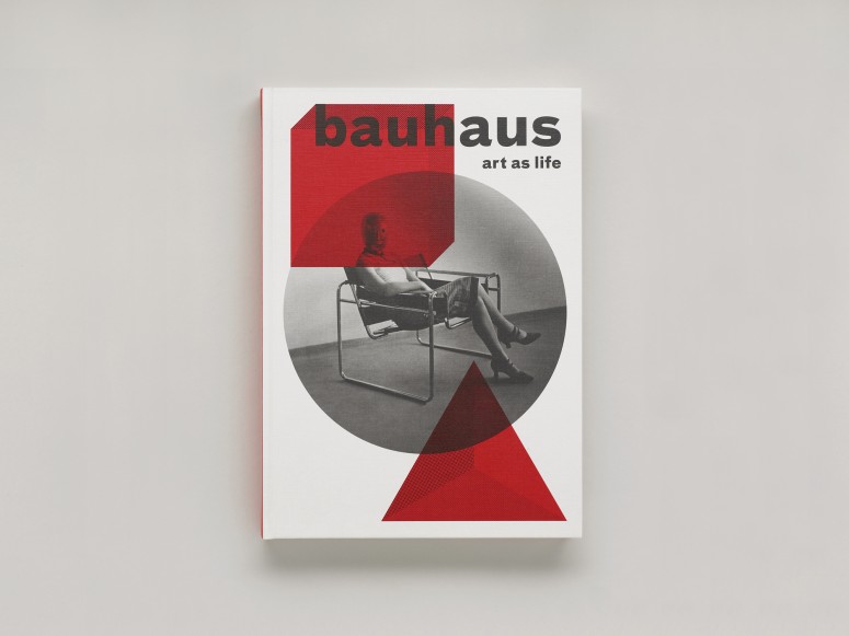
Title: Bauhaus: Art As Life
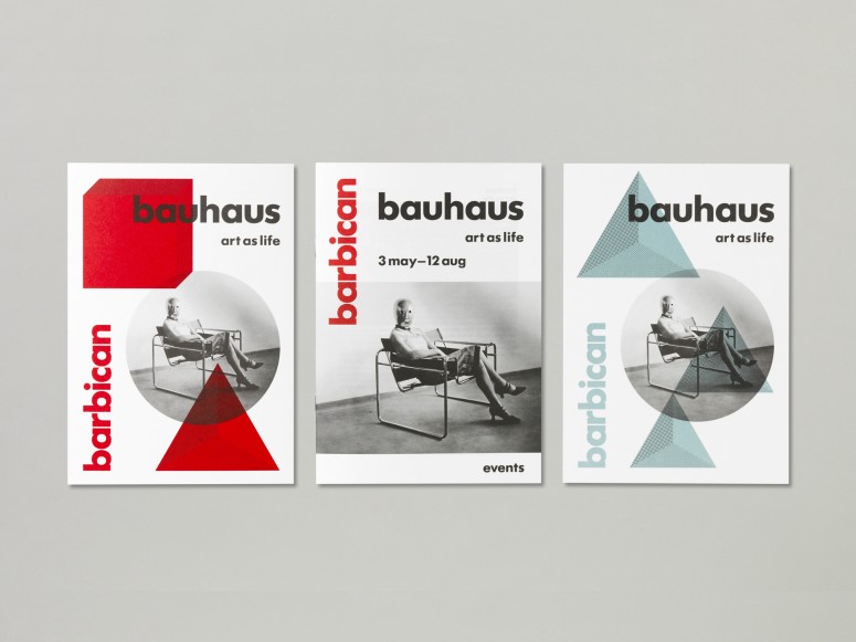
Project: Exhibition Design, Catalogue & Marketing Materials
Client: Barbican
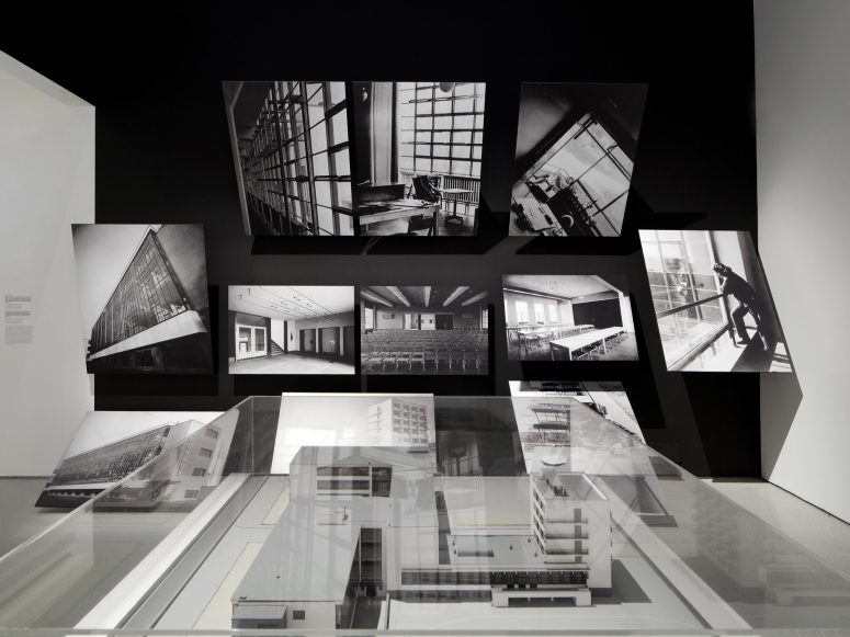
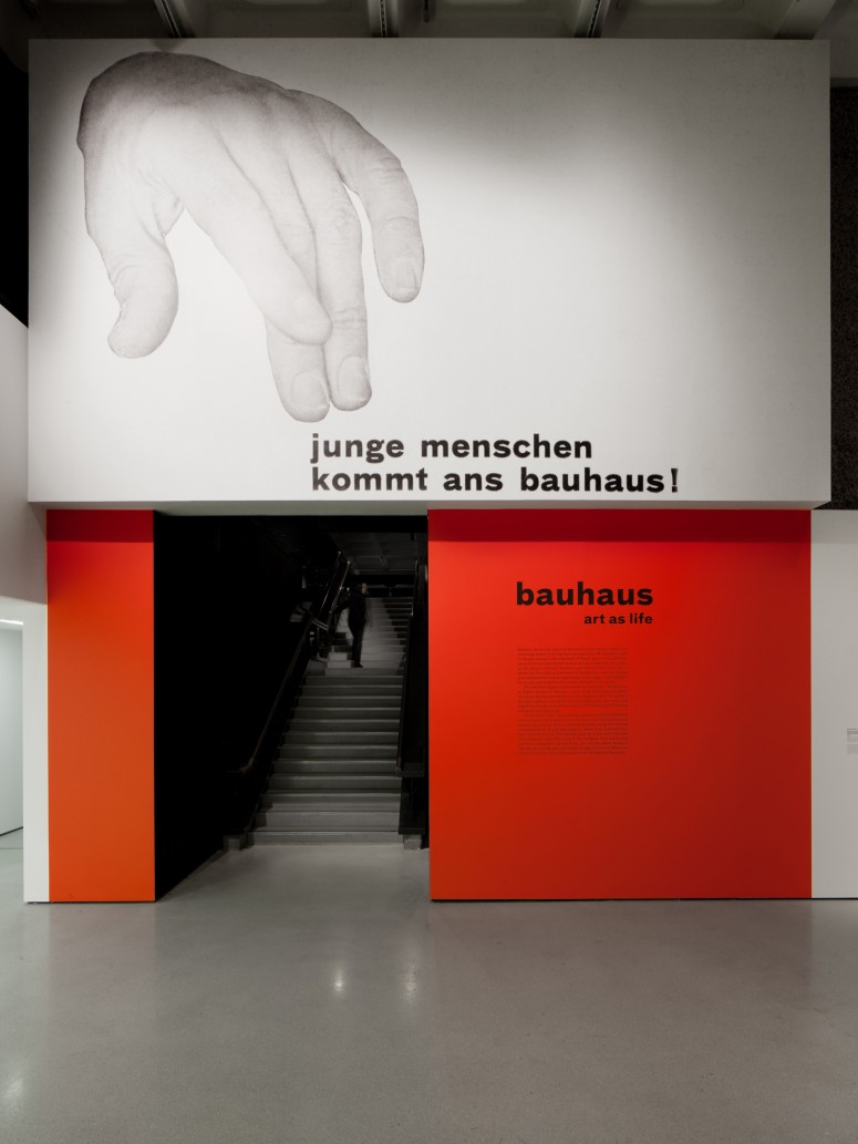
Bauhaus: Art as Life at Barbican Art Gallery was the largest exhibition of Bauhaus work to be held in the UK for almost 40 years. Alongside architects Carmody Groarke, we were challenged to work within the Barbican Art Gallery’s complex layout to create an installation and graphic scheme that would lead visitors through an exhibition narrative encompassing over 400 Bauhaus works. Our design aimed to contextualise the content of the exhibition whilst avoiding pastiche. Graphically, it was informed by an awareness of the Bauhaus’ own principles of colour, structure and typography – painted walls, bold panels and supergraphics draw together objects, themes and ideas, and the typeface used throughout is a contemporary revival of the letterpress typeface used within the Bauhaus itself, Breite Grotesk.
Title: The Art and Craft of Richard Woods
Project: Book Design
Client: Lund Humphries
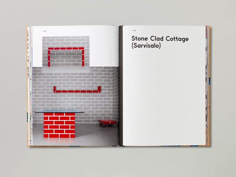
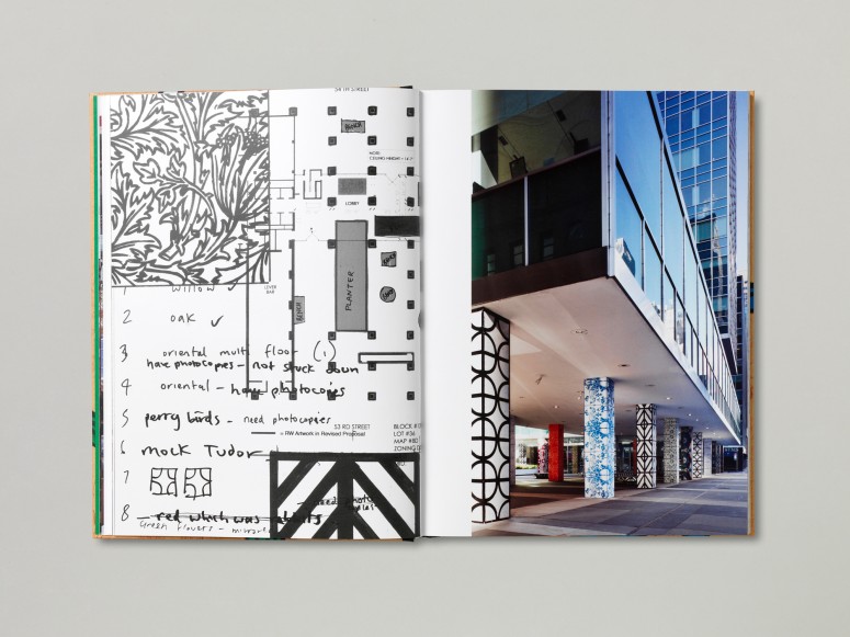
This book showcases the work of Richard Woods, an artist and designer who practices at the convergence of a variety of disciplines ranging from architecture to furniture design—it’s a scrapbook of his works, ideas and production processes. We worked closely with Woods for the book and, after extensive dialogue and several visits to his studio, decided on a format that emphasised the strong visual character and impact of his work, with graphic interventions kept to a minimum. Photographs and installation shots are presented full-bleed, interspersed with sketches, working notes and facsimiles of press releases, email exchanges and magazine articles. Divider pages cut through the book as the only intervention amidst the assortment of collected ephemera, and on the cover, the title is silkscreened over an image from one of Woods’ works.
Title: Design Research Unit 1942–72
Project: Book Design
Client: Koenig Books / Cubitt Gallery
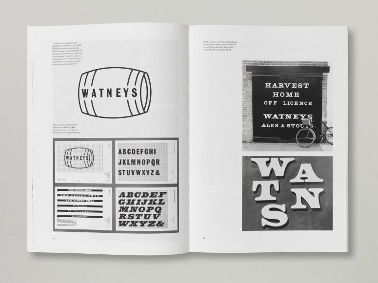
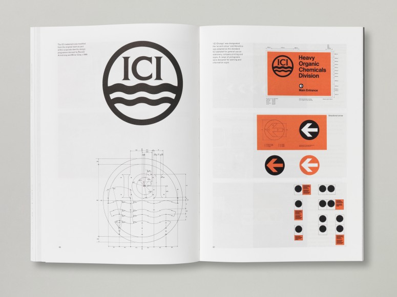
Design Research Unit was formed in 1943 as the first ‘full service’ design consultancy in the UK, bringing together expertise in architecture, graphics and industrial design. Based on original research, this retrospective publication was produced to accompany last year’s touring exhibition about the DRU, curated by Michelle Cotton.
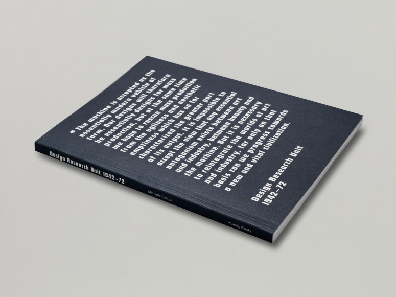
This project was a graphic designer’s dream to work on. Its design took its cues from a broad range of DRU materials including early studio documents, advertisements and commonly-used typefaces. The book is set mostly in Monotype Grotesque, which was used widely in their studio work, and Futura Schlagzeile is used on the cover and throughout as the headline typeface, echoing an early advertisement for DRU predecessor the Industrial Design Partnership. The cover displays a quote taken from a leaflet (c.1943) that Design Research Unit supplied to prospective clients, along with artists and designers, outlining what the agency stood for and how their design process worked.
2. The theme of this year’s TYPO London is »Social«. Do you consider design to be a social discipline? Which design project do you consider to be particularly socially relevant?
Design, and especially graphic design, is a social discipline almost by definition; it’s about communication and human interaction, and you can’t get much more social than that. Our own work is the product of extensive conversation and collaboration—often having to take on or adapt to new roles beyond that of a graphic designer—and we never work in isolation, so a large part of our own practice is social in nature.
Two projects we’ve worked on which stand out as having a particularly social focus or relevance are The Hepworth Wakefield and Royal Docks; very different projects which share a certain commonality when it comes to their ambitions. As the UK’s largest purpose-built exhibition space outside of London, The Hepworth Wakefield has made a significant contribution to the ongoing urban regeneration of Wakefield, and since opening in 2011 it’s had a tangible impact upon Wakefield’s regeneration—helping to secure private funding for the renovation of the surrounding listed buildings and attracting hundreds of thousands of visitors to the area. It’s great to think that our designs for its identity, signage and wayfinding and exhibition graphics have contributed to that.

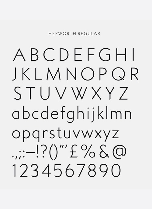
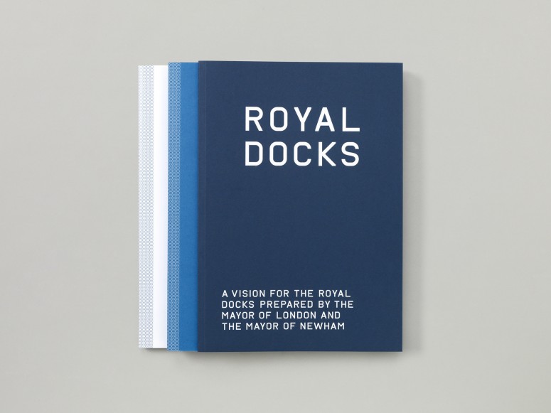
The second project to mention here is Royal Docks, a series of publications we designed and are continuing to work on for Design for London which present a vision for the regeneration of the Royal Docks, a large area within London’s Docklands. Part of the brief was to undertake a substantial research project focusing on Royal Docks, and create a series of typicalities to capture the history and character of the area—the graphic identity that we created for the project was borne out of that research. When proposing changes and developments to an area on such a grand scale, it’s important to acknowledge that area’s history in some way; hopefully our research and designs will contribute to this as the project progresses.
3. A conference like TYPO London is in itself an obvious example for a social event: what are you especially looking forward to?
As sycophantic as it sounds, we’re really looking forward to hearing the other contributors’ talks. Events like this are all about getting people together, sharing insights and experiences, and being socially present in the professional community, so it will be a fantastic opportunity to learn from each other.
4. Required reading/watching: What are currently your favorite interesting/beautiful publications, exhibitions, books, movies and/or websites?
The current exhibition about Bruno Munari at the Estorick Collection of Modern Italian Art sounds brilliant—it’s open till late December, so if you are in London for TYPO it should definitely be worth a visit.


