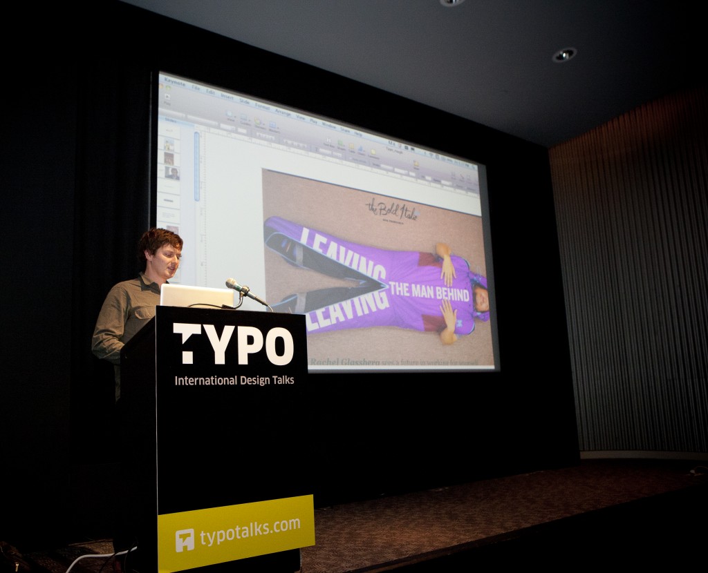
Heath also provided a wonderful definition of TYPO SF: it’s like Comic Con for design nerds: we are a passionate bunch of weirdos … even if we don’t wear costumes.
But to get to the point of his talk, Heath introduced us to the vision and evolution of The Bold Italic, the web and (now) print magazine where he works.
An Uncertain Media Landscape
The way the media pendulum swings is vital for Gannett (Heath’s employer), the second largest media company in the country. Recognizing the need to evolve in a rapidly transforming media landscape, they started a Design and Innovation Team to see how they could take advantage of the changes happening.
So they partnered with IDEO, and decided to explored the ways local media wasn’t meeting San Franciscans needs. These were their findings:We want the story behind the story
People use insider information as social currency. In the SF Bay Area, we like to peek between the cracks in the window blinds to see what’s going on in there and beat our friends to the scoop. We want to know not just the drag queen’s name, but also what’s in her closet, where she’s from, what her favorite dessert is.
We want local media to serve as a sense maker, or curator
There’s so much going on, we want media to let us know not all of it, but what we should know about, what we want to know. We want entry to relatively closed systems, such as subcultures and scenes that are building the radically changed world around us.
We want the opportunity to participate and self-reflect
To meet this need, The Bold Italic team decided to attempt to Invert the paradigmatic top-down process of media, providing readers with opportunities not just to learn, but also for action and interaction.
People want elegantly designed information
San Francisco is a design capital, and it’s populated by a bunch of fantastic weirdos. And that makes both the design of information and all the weird stuff about our local history and culture vital to the presentation.
Looking at the locals
After deciding what the people where looking for, The Bold Italic team decided to look at how to categorize the people with those needs. They established three basic groups:
Kin: this is basically everybody; all the social groups out there.
Provocateurs: the ones driving their Kin to check out unusual things, making these people an obvious target for Heath’s team.
Merchants: San Francisco’s hyper-localized mercantile environment makes the merchants as important to address as the Kin.

Heath Kessler
Hence, The Bold Italic
The Bold Italic intends to give the city a voice; locals design and write the stories, and the articles’ audiences vary from general to very specific subcultures.
Then they decided to set several standards for the presentation of content:
The first gamble: One image above the fold. The Bold Italic team decided to invert the standard webzine model. Instead of focusing on lots of little things every day, they decided to focus on just one idea, and doing it very well. The challenge then becomes how to bring the story to life in a way that doesn’t drive people away, that it becomes too weird or focused to address a larger audience.
For headlines, they selected Knockout, and they’ve found ways to make it express everything from deciding on what it means to like in San Francisco to presenting a story on San Francisco’s pornographic history.
The writing should be first-person and uncensored, for example: “Living in San Francisco means hearing your neighbors fuck.” On first reading a story should seem so familiar that it seems addressed to you, even if it’s all about a life that’s nothing like your own.
Build on a three-column grid.
End all stories with a how-to, a guide for readers to take this content further and experience more of their city.
And, the most vital rule: The Bold Italic can break its own rules. Simple constraints can lead to infinite variation and creative solutions.
The overriding challenge: creating flow. Making sure that each day of publication could be presented in a unique way that addressed the story at its heart without throwing readers off. And that, in the end, is what defines the brand.
Microhoods
Eventually The Bold Italic team noted that story pitches tended to come from what they called “microhoods,” miniature neighborhoods within neighborhoods. So they decided to throw parties in each microhood they identified. The parties are led up to with features on the area that highlight players in the locale, introducing people to the spirit of the area. And then they throw a 3- or 4-block block party.
Area merchants provide the food and drink, local musicians play and artists/photographers display their work. This creates the opportunity for the reader to not only learn about, but actually dive right into the spirit of the place.
Next challenge: create a print magazine
Tell familiar stories in unusual ways: for instance, a fashion story told through the eyes of icons in other fields, such as art, publishing, education, etc.
After a few of these microhood parties, the team realized that people wanted something tangible to take home with them, something to grasp about the publication that brought them out for a great experience.
And hence, The Bold Italic. Issue three’s files ship to the printer Monday. Look forward to it.
Written by John Moore Williams


 Photo Credit: Amber Gregory


Pingback: TYPO SF & Eye: new guest blogs on typography and design - John Moore Williams