


Photo: Gerhard Kassner
Under basic licensing, it is impossible to use professional fonts on mobile apps and Ivo’s mission of the day was to offer the audience new possibilities and alternatives when choosing fonts for mobile platforms.
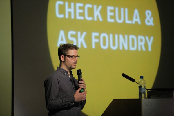
Firstly, we were treated to a price comparison of mobile fonts from the FontFont library and a variety of unnamed foundries, highlighting the various packages and costs involved. Next up was the legal bit. When considering fonts for mobile, Ivo encouraged the audience to check the Eula claiming that while ‘EULA is not sexy it can become your friend too’!
Doubtful that a future industry standard is on the horizon for mobile fonts, Ivo is optimistic about the alternatives available. However, the road of free fonts is one he believes to be taken with caution, insisting that while most free fonts are free for personal usage they do require licensing for commercial projects. He believes that when used commercially, free fonts can end up costing the same and that the compromise on quality is not worth the risk. To iterate this point, Ivo showed the audience case studies of typefaces that were converted to professional fonts, jumping from 203 characters to 747 and from 4 styles to 10. The facts spoke for themselves.
Through Mobile FontFonts, it allows designers to specify fonts outside the standard ones available and gives designers more choice when striving to project a cohesive brand ensuring fresh fonts that are not over used. To hammer this point home, Ivo presented the audience with a type ‘Face-Off’, comparing Mobile FontFonts to popular workhorse that Ivo feels are over-used and inappropriate for mobile devices. First up was Palatino versus FF Daxline Mobile Pro, an alternative that has no spurs and is a fresh, modern alternative to Palatino. Ivo also presented FF Good Condensed Mobile Pro as an alternative to Verdana, which he feels is too wide and extended. A comical moment was looking at alternatives to Chalkboard which he stated was ‘a bad comic sans, and for those of you who thought it couldn’t get worse, Apple proved you wrong’. Ouch!

Ivo Gabrowitsch
Deirdre Breen, Graphic Birdwatching


Pingback: Fontblog | TYPO London 2011 im Rückblick