


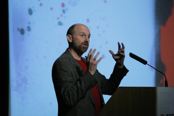
 Photo: Gerhard Kassner
Interestingly for what is historically a typographic conference Andrew was quick to downplay the role of typography in their work, often calling it ‘the straight man’. Used sparingly and where relevant, and not for self expression.
He talked in detail about his education, points of reference, and with humour reminiscing about the formation of GTF and their lucky brush with Noel Edmunds that afforded them their first design indulgence. But the two most intriguing themes that resonated were that of collaboration and tactility.
Collaboration
Whether it be photographers, such as Nigel Shafran, illustrators, such as Kam Tang and Nick Higgins, manufacturers and clients, Andrew pointed out each one’s influence and importance in their process. Citing their Shakespeare Globe work as a specific example of this, Andrew talked about how enriched the project became by what Nigel Shaw instinctively brought to it. Not quite documentary photography, not quite staged, it straddled the two, and made for a compelling series of imagery that gave them something they couldn’t quite have imagined.
Tactility
Every piece of work that Andrew showed had tactility. He went into great detail about the production processes, the mechanisms and the materials they worked with. He championed the importance of making ‘things’ and testing them, suggesting a render can never prove the success or relevance of an object, particularly if trying to pitch it to the client.
From that tactility there was also an inherent sense of Nostalgia. When talking about design decisions, many were associated to a memory, or possessions or object in his past — reminiscing about their relevance and how and when best to re-appropriate them.
Which is intriguing. Increasingly it feels like there is less of a place for nostalgia in design. The industry is constantly reaching for the next boundary to test, and as media increasingly moves onto a screen the divide between what we touch and what we feel widens. Clients are focussed on justifying budgets and as a result designers are fixated on discussing ‘the bigger picture’. Refreshingly Andrew didn’t speak in client language. He spoke with passion, warmth, affection, and of meticulous detail.

Andrew Stevens
While much has been made of the friction between Art and Design at this conference, you cannot fail to appreciate the art in GTFs craft.
Text: Matt Judge, DesignAssembly


Pingback: Fontblog | TYPO London 2011 im Rückblick