


Which work are you particularly proud of? Which work best represents your style or approach?
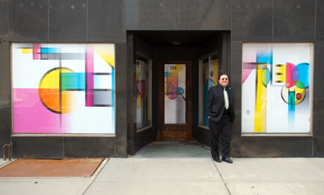
I am proud of my design for the AIGA Toledo (Ohio) Downtown Windows project, that was installed in April 2011. I know this will sound very pretentious, but I was inspired by the Josef Muller-Brockmann designs for the Music Viva concert series. I attempted to take Muller-Brockmann’s Concrete Art approach to a degree. I drew all of the geometric sans serif faux Futura-like letter forms treating them as abstract geometric forms. I limited the color palette to cmyk primary colors and let them freely mix where the geometric letter forms cross the colors mix. The end result is sort of a Modernist, or I suppose it’s more of a Postmodernist stained glass window.
What inspires you?
I am inspired by things that either surprise or astound me. I suppose we all are. But I would never have started researching the subject for my TYPO talk on the unexpected, near psychedelic manipulation of Modernist Grotesque typography, if I had not discovered the Gerstner designs for Sinar camera equipment advertisements last summer. At the time I was researching for my talk on dimensional typography at ATypI Dublin, and these oddball designs kept popping up! I could not explain them. So I wrote people like Steven Heller or Rick Poynor or Paul Gehl and no one could explain what was going on. So now, hopefully I can and will in a few days!
Which character/letter would you take to a deserted island?
God what a question! It would probably be J so I could lay it on its side and use it as a cushion to float to civilization! Wow that would be a great skit for Sesame Street animation!
TYPO Berlin 2011: What are you especially looking forward to?
Everything! OK I have to admit being a Calartian (a being who studied at the California Institute of the Arts or CalArts. I earned my MFA in Graphic Design there in 1993). I particularly look forward to April Greiman’s presentation.
For TYPO-veterans: Your favorite TYPO-moment?
I am not a veteran.
Required reading: What are currently your favorite interesting/beautiful publications, books and links?
Anton Stankowski‘s Frei Und Angewandt 1925-1925 (in English its Free and Applied Art 1925-1995). It was by far the most helpful in explaining the Zurich hot house for design that lasted from 1929 to 1936, which little has been written about.


Pingback: TYPO Berlin 2011 “Shift” Is Coming | The FontFeed