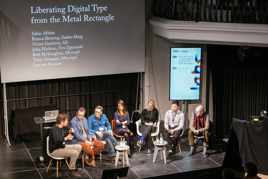
Forced to think inside the box
When latin letters became typography, they took the physical form of little boxes. With that sidebearings were born, still to be found in digital fonts today. Letters consist not only of their shape, but also of a beginning and an end. What might have worked for Gutenberg’s boxy blackletter, soon resulted in individual solutions for different printing sorts: parallelograms to compensate for the slant of designs, bits removed from the rectangles to allow kerning. But in essence it’s still the way it works in digital type: sidebearings define the rectangles, kerning the exceptions to the rectangles. As type designer Nina Stössinger has put it: “We’re still stuck to that old metaphor and I wonder if it has to be that way.”
Due to the exceptional nature of kerning, it doesn’t scale well either. With an increasing number of glyphs in a font, the number of potential kerning pairs grows exponentially. Bianca Berning confirms this from practice, not only does kerning take up a lot of time, it also takes up a lot of space in the font files. Class-based kerning only helps to a certain degree.
There are efforts made to move away from the box. John Hudson shows examples of how Microsoft handles text setting math equations, where letters don’t adhere to a baseline. Fonts like Cambria Math have “sidebearings” in the form of rectilinear polygons that allow a good fit even when lettershapes are moved vertically.
When Toshi Omagari designed Bubble Kern, a tool to assist with kerning, he was inspired by this approach. Here the designer draws a shape around letters, Bubble Kern creates kerning pairs and values based on these shapes. Even the ones the type designer may not have considered. It’s not failproof, he says, and might require additional kerning, but it can speed up the kerning process.
The bigger issue: complex non-latin scripts
The model of boxes and exceptions might be tedious and overly complicated for latin type, but it doesn’t compare to the issues it created for languages and scripts that have a entirely different approach. Forcing this current system onto complex scripts, often doesn’t do them justice. John Hudson shows Telugu, where letters are stacked vertically and need a more precisely defined space around them. He also points to the arabic script, where the space between letters can vary depending on form. He raises the question of what it is exactly that needs to be spaced, is it really the glyphs themselves? Sahar Afshar also shows examples of the arabic script, its calligraphic nature allows a lot of freedom in varying forms and vertical positioning. Arabic writing can expand and contract und fill a space more freely in all directions. These liberties have a hard time finding a place in typography that is defined by horizontally placed consecutive rectangles of the latin script. One approach to solve some of these issues is presented by Victor Gaultney. In the Graphite technology, designers can define areas where diacritical marks can be placed, in clusters of letters the marks get shifted around automatically in order to avoid collisions. The advantage of this is that designers of type don’t need to anticipate all possible letter combinations beforehand.

© Norman Posselt (Monotype)
Don’t be a square
So what solutions can be implemented to overcome these problems? Solutions occur at different stages: tools like Bubble Kern try to optimize a process that works with the current solution, Graphite aims to supplement current font technology. Victor Gaultney as well as Toshi Omagari can see their ideas find their way into OpenType and work on font level. Rob McKaughn urges to keep focussing on what we are trying to solve: solutions for a workflow or something millions of people who read and write in complex scripts could benefit from. John Hudson also proposes aiming higher, if we are to overhaul the box and kern model why should we still draw shapes around shapes, why not think bigger? There are currently several experimental approaches with neural networks assisting in type design – compared to that spacing and kerning are more trivial issues. A well trained neural network could provide solutions. One level higher is text rendering, Bianca Berning asks if these issues couldn’t be solved dynamically in real time?
At a conference dedicated to showcasing the efforts made to make variable fonts a reality, this all still seems a long way off. But who knows, maybe fluid fonts will be the main theme in ten years time.

© Norman Posselt (Monotype)


