


Nearly 500 Million people use Devanagari. The gap between these potential users and the available typefaces is very large. This has less to do with the supporting foundries in and outside of India but more with the rules of the market. Similar to the rapid disappearance of the signpainting business due to desktop publishing, system fonts and large format plotters, high quality contemporary indic typefaces face the convenience of the users. Apart from the global temptation of piracy.
More high quality fonts with more options for more applications support the appreciation of design by the users. The technical evolution yield to tools that tackle pretty much all of the big challanges already. Oddly enough, technical limitations of the hot metal era were adopted by lettering artists and are still reproduced today. Although the limitations, particularly horizontally set conjuncts, were already being solved in the phototypesetting era.

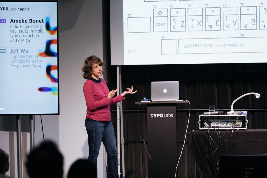
Amélie Bonet on the typical pitfalls when designing and engineering Indic typefaces. Photo: Norman Posselt (Monotype)
Although even multiple stacked conjuncts are easy to provide nowadays, big publishing houses in India still use proprietary fonts. One reason for this are proprietary software environments. Each publishing house uses its own technology instead of InDesign and Unicode. There is a huge lack of standardisation. For the companies, it is still a tough decision to switch from running system. Besides, often it’s hardly affordable.
Anyhow, todays shaping engines provide everything needed for responsive and cross-platform display of Devanagari. From World-Ready composer in inDesign, over Microsofts Uniscribe to Apples Core Text and Pango.
While Devanagari used to be offered only as light and bold cuts once, meanwhile the available Devanagari fonts are shipped in a lot of weights. The common shape of Devanagari designs back in the days was blocky and with tight spacing.
In focus: An indic type project on Devanagari, from engineering to marketing via design. © Norman Posselt (Monotype)
Today lively and bouncy designs break the text-font barrier and extend the scripts variety. These improvements are not least boosted by the work of the Indian Type Foundry (ITF) and designers from all over the world, which provide helpful macros, localisation features and local dictionaries. So not only the script gets improved, but also the typefaces which make use of it.
With more power, the resposibility to teach these growing opportunities to the user become mandatory. Advanced and easy-to-access specimens and manuals are needed to profit from all the improvements. But similar to OpenType variations, telling the users how big opportunities are, is, was, and will be the toughest challenge of all.


