


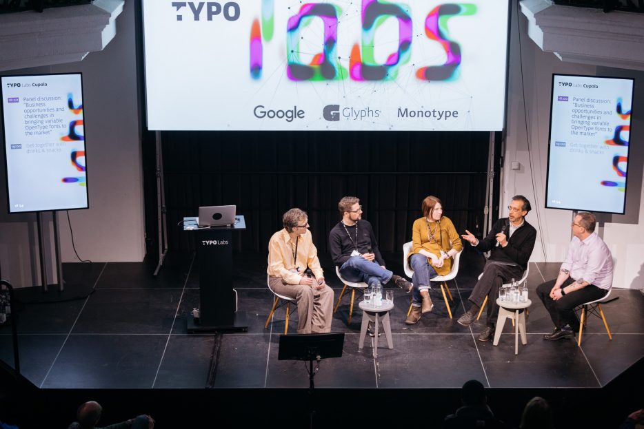
Who needs variable fonts? And how and when?
Starting on a postive note: no variable font deniers attended the panel, those predicting the next chapter of Multiple Master and GX failures. The views on benefits and audience of variable fonts were not unanimous, however.
A large issue the industry sees itself confronted with is user acceptance. How will the variable fonts find users and vice versa? Who are the primary customers of variable fonts? Alexandra Korolkova shows the customer base of Paratype as a pie chart: agencies open to such novelties only make up a small group. The industry in Russia is behind, her client base is conservative, the foundry’s move to OpenType was laborious. Matthew Rechs wants to target the “normals” with Typekit, everyday users beyond typographers and graphic designers. Users that would move to Typekit from freefonts. David Berlow currently sees the target audience for variable fonts first and foremost in the alliance: the tech companies that need to implement the technologies. They are the ones that need to be evangelized in order to right the wrongs of desktop publishing, such as size specific designs getting neglected when type went digital.
© Norman Posselt (Monotype)
Besides inclusion in OSes, users will get their hands on variable fonts when foundries and distributors start shipping them out directly. Ivo Gabrowitsch proactively suggested bundling variable fonts to entire family sales by default. Alexandra Korolkova’s idea of adding variable fonts with limited range to font sales, in order for users to get a taste, is more constrained. Besides direct delivery, the fast paced nature of the web and centralized architecture of font hosting platforms offers the possibility of a gradual, silent move to variable fonts. Users could be offered design solutions without them requiring knowledge of the ins and outs of font variations axes. This would make them susceptible to their potential. David Berlow and Matthew Rechs could both see this happening for TypeNetwork and Typekit respectively. Adam Twardoch pointed out that it’s already happening in OS X, for instance.
Give a variable font vs. teach to variable font
At the heart of this debate are two approaches: using variable fonts to prefabricate typographic solutions or presenting them as a specialised tool that experts can tinker with. Web services will likely be the first to roll out variable fonts. As pointed out in the audience, platforms selling ready-made designs can offer typography with variable fonts a lot quicker than Adobe can even create an interface that allows professionals to dive into all the possibilities. And even before that interim solutions like plug-ins will pop up. The caveat of handing over complete control of this new technology is that it might leave users unable to cope. David Berlow gives the example of size versus optical size – two dials can confuse users, these problems should be solved programmatically. Furthermore designs might even contain axes in the parametric realm that aren’t meant to be accessed. He sees the new technology as Trojan horse – type designers have to wait until they’re inside before they can jump out.

Opposing that is the argument that educating users and giving them access to features is beneficial to the acceptance of technology. To accept it, they have to use it, to use it they have to learn how it works. Spotlighted projects that show off features can serve to educate as well as marketing, according to Ivo Gabrowitsch. The long contended issue of Adobe’s UI and opaque handling of OpenType features is seen as an obstacle that accounts for the fact that OT features are still not widely understood. From this point of view education on the possibilities is essential and a cohesive variable fonts panel for Adobe products plays a crucial role in that.
All agree that people are intrigued by the possibilities, like seeing variable fonts in action and are curious to know when they will become a reality. But playing with sliders is only fun for two hours, says Alexandra Korolkova and is skeptical, that this creates a lasting value. David Berlow agrees, sliders also don’t serve as a marketing tool and true solutions aren’t marketed.

The hot-button issue: Pricing
It was mainly due to impulses from the audience that the issue of pricing came up repeatedly (and David Berlow repeatedly refused to comment). While brushed upon by Ivo Gabrowitsch, who suggested to keep prices low and similar to those currently asked for entire families, some feared a decrease in value of the creative potential that new type offers and therefore also in the value of labour of type designers. An issue that is already evident in OpenType, where a growing numbers of features are being packed into one font file and move out of sight for many users. Like examples in the past show, it is easy for larger companies that can take a hit, to set precedents that might turn out to be harmful to independent foundries. Are we willing to pay more for an optical size axis, if we don’t know it’s there? David Berlow says yes, as it offers an increased typographic value. Matthew Rechs’ opinion was that increased availability, which platforms can offer, doesn’t need to lead to perceived value diminishing. Pricing and timeframes are the topics all panelists were least willing to make statements on – a lot still remains to be seen. As David Berlow puts it: the future is now, we can wait.


