


Based on the idea of the Typotechnica conferences before, the annual type conference AtypI already was providing these technology orientated “warmups” before the actual conferences, and for years already, they had been a huge success. Therefore I happily embraced this techy friendly extended version of TYPO Berlin (located at the coworking space Forum Factory, nearby the Jewish Museum) a lot.
But not being a hardcore techy myself, only interested into the technology behind the designers part of font design (at least being a Glyphs user and beta tester) how could I survive for example in the classrooms beside all these brilliant brains?
Just join me on this adventure of my self experiment.
GlyphsSDK: Write Your Own Glyphs Plugin
For me, the kickstart of these two exciting days was the workshop, hosted by Rainer Erich Scheichelbauer (schriftlabor.at | glyphsapp.com) from Vienna, the team partner of Georg Seifert (schriftgestaltung.de | glyphsapp.com) from Berlin (the mastermind behind Glyphs font editor) was taking the Glyphs users behind the scenes of this great font application. The fact, that these two developers actual both are trained designers also, made it less frightening to me to attend this programming class. Even I had no knowledge of Python (not even basic, which was recommended), I took the skill to write my own Glyphs plugins.
 Known to many as his GitHub profile, Rainer Erich Scheichelbauer took his classroom behind the scenes of the great Glyphs font application.
 Just in time for this workshop, at 0:03, the same day, Rainer and Georg had uploaded the freshest version of Glyphs. After the usual WIFI difficulties, everybody had downloaded Glyphs 2.3, and the matching, “snippet” providing text editor “Textmate”.
If not familiar with it already, we got introduced to Github (a fantastic platform for scripts and plugins).
One of the most essentials, Rainer was telling us was something, everybody just loves to ignore: “Always read the READ ME first!”.
After having downloaded a prepared Python script, we had a funny “try and error” game, typing and copying texts into our scripts. I found myself doing very well, suddenly got lost a line 19, and supported incredibly patient, and helpful by Rainer, I and (several others) got back on track a few minutes later. This was so much like in THE MATRIX movie!
I can highly recommend to any type designer to once have a deeper look into the engine of your font editor, to understand, what is actually possible. Knowing more about the technics behind font design is actually very helpful for the collaboration with the font engineers, one is working with.Another useful phrase by Rainer: “At a Python Dojo: Never CamelCase!” Welcome to the world of geeks!
Responsive Lettering / MutatorMath Designspaces:
“I’m not an interaction designer, I can only make stuff, interaction designers can play with”
After after all this hands on brainwork, the Dutch type designer and programmer Erik van Blokland (www.typecooker.com | letterror.com | @letterror) was talking about the changing demands to fonts in general. After some hundred years of working with fixed sizes of layouts, the designers now are almost lost in space. By showing the hilarious illustration/animation of a responsive cat, he was explaining that the times, when the text was limited to the print space and within a limited rectangle are definitely over now. Forget about the 15th century principals of beauty! These days,the weights are getting less important and it is all about the width of letters.
To deal with a flexible justification, Erik is recommending to use different widths of just a few letters in you designs. For example only the upper cases or “m” and “n”. To create these needed fonts, interpolation is the key.
We learned, that ADOBE SANS is actually a very clever font. Due to the fact, that we only get confronted with it when something goes wrong (like the replacement of a not exported actual used font in PDFs), ADOBE SANS unfortunately has a quite bad image. But these replacements are only possible because it provides so many different widths for each letter.

But there will also be one more axis, he still keeps secret, and just mentioned: Something surprising to look forward to.
With the changing environment for the use of fonts, another very important axis, all the font designers and programmers now have to deal with, and carefully to set up is the pricing. If the designers now are using all these extended, large font families, someone has to design (and programme), how should these be calculated? This is definitely something that need to be discussed within the whole community.
Localises it, globalizes it
After lunch, the Berlin based French type designer and font engineer Amélie Bonet, was explaining the challenge of localisation of global scripts. Being not only an expert on Indic letterforms, she is just the right person to be your guide through the jungle of the localisation of worldwide writing systems.
This was the perfect introduction into the complex Avenir Next project, she is working on for Monotype.Starting with Cyrillic Bulgarian, the confusion of localising certain letter shapes for certain languages began with the fact of already different versions of single glyphs within only this particular language. While the difference between Bulgarian and Russian cyrillic is handled by the use of the matching language code (while Russian will appear as default and Bulgarian needs to be selected in the dictionary), the several versions of the same glyph within one language are causing problems.

For Serbian it is even worse, since this language is using latin, but also cyrillic. For the entire font, the specific script needs to be adjusted by the use of a stylistic set, because Adobe is not supporting the Serbian language code locl.SRB yet. And all this needs to be communicated to the graphic designers too.
Going even further East, it is not only about Latin and Cyrillic anymore: Especially all the different Indic scripts need to be localized.
Font developers are only providing the tool and not the application. So there is quite a need for the tight collaboration between font and software companies and developers. For example: Devanagari is not only the script for certain parts of India, but also for Nepal. But here, the shapes are slightly different, and need to be localized especially for this language too. And this is just the peak of the glacier. All the Indic scripts and their complex, completely different to Latin, system are challenging the font editor and design software developers a lot.
A nice feature of Amélie’s presentation: All the examples she was showing (except two), where designed by female type designers.
Font Gamification with Rainer Erich Scheichelbauer
He showed several very cute applications done by his Austrian student’s. Most of these lovely animation-like programming masterpieces (actually mostly OpenType ligatures) were reflecting the world of early computer gaming: Pong, Snake, Pacman, etc.
Another one: The word “Gezi” will squeeze the surrounding letters away, deforming them. “Gezi Park takes its space.”
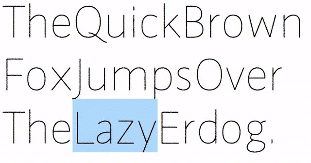
Having attended the ISType 2013 in Istanbul, and being inspired by “Gezi park protests”, Rainer was using the font “Galata” (going to be released later this year under his own label Schriftlabor) to transport a special message in the “required ligatures” feature, which cannot be disabled by the user: Whenever the user is typing the name “Erdogan” the text will change itself into “Erdo gone”. Another one: Typing a certain letter combination the word “GEZI” will pop up, by squeezing the other letters before and after away, deforming them. “Gezi Park takes its space.”

Rainer Erich Scheichelbauer gave a fabulous closing lecture on one of the fun parts of type design: OpenType features, often used for playful ligatures and all kinds of a type geek entertainment.
What really impressed the audience was the “Marienbad” game Rainer had put into the font, inspired by the French drama movie “Last Year in Marienbad” from 1961. When the “Marienbad Artificial Intelligence” OpenType feature is selected, the font starts to play the game against the user, like in the key scene of the famous movie. And just like in the movie, the user has absolutely no chance against this “unbeatable font”. This feature alone took more than 700 lines as a feature code.
Now, I’m very much looking forward to enjoying the BBQ.
– –
Photographs by Norman Posselt / Monotype


