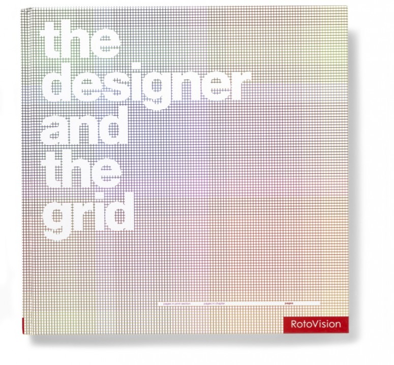
Alongside studio-based work, Lucienne writes, lectures and publishes on her subject. A signatory of the First Things First 2000 manifesto, her books include The Designer and the Grid [Rotovision, 2002] and Good: An Introduction to Ethics in Graphic Design [AVA Academia, 2006]. Her latest book, Design Diaries: Creative Process in Graphic Design [Laurence King, 2010] was co-written with design educator and writer Rebecca Wright.
With Rebecca, Lucienne is co-founder of GraphicDesign&, a pioneering publishing house dedicated to creating intelligent, vivid books that explore how graphic design connects with all other things and the value that it brings.
For her presentation at TYPO London (October 19, 2012, 11:00 am in Jeffery Hall), Lucienne will be joined by Rebecca and the social scientist Nikandre Kopcke.

Lucienne Roberts
1. Which work are you particularly proud of? Which work best represents your style or approach?
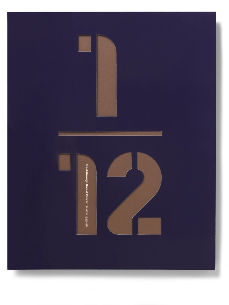
Given the theme of this year’s TYPO London it’s apposite to show work that I am proud has made a difference ‘socially’. Here’s an old favourite, an annual review for Breakthrough Breast Cancer when I was their design consultant. At the time one in twelve women in the UK developed breast cancer so using this as a theme seemed obvious.
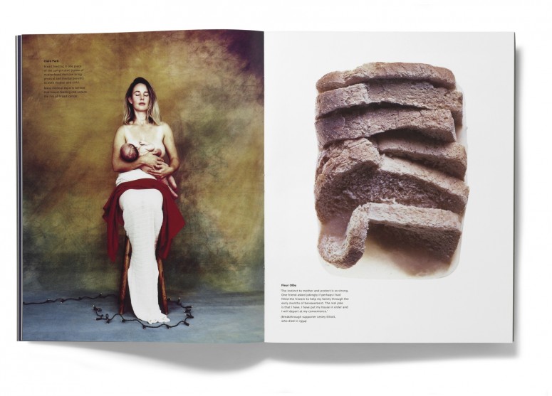
 Twelve photographers were invited to work with us. Shown here are the contributions from Clare Park and Fleur Olby. Fleur’s is a heartrending shot taken in response to hearing about a woman who had frozen food for her family before she died.
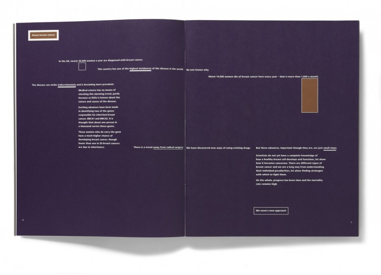
This text spread is really indicative of my approach to typography. Ever since reading Jan Tschichold I’ve been interested in the relationship between abstract art and typographic layout. Here the graphic interventions are restrained – a combination of alignments and large blocks of colour guide the reader around the text.
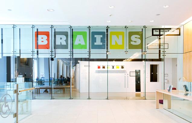
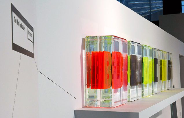
The subject matter was a bit gory but I took real delight in working on the recent Wellcome Collection exhibition Brains: the Mind as Matter and making the material as accessible and engaging as possible. The show’s focus was not what brains do to us, but what we have done to brains in the name of medical intervention, scientific enquiry, cultural meaning and technological change. Slicing, cutting, collecting and classifying were our starting point. We wanted to ‘preserve’ the exhibition title and visited the Royal College of Surgeons to learn how specimens are made. Shown here is the entrance and our title graphic. Each letter is made of ‘slices’ of Perspex contained in an acrylic box filled with glycerin and water. The refractive index matches that of real specimens so at different angles each letter appeared in multiples.
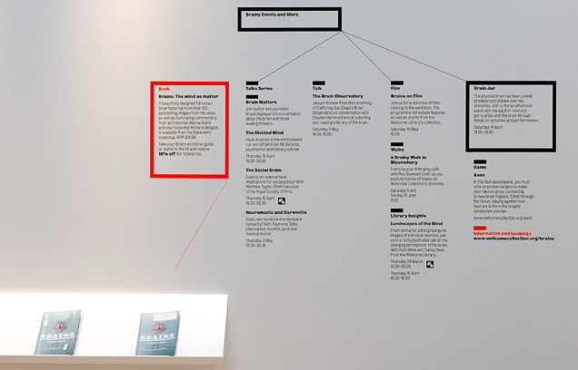
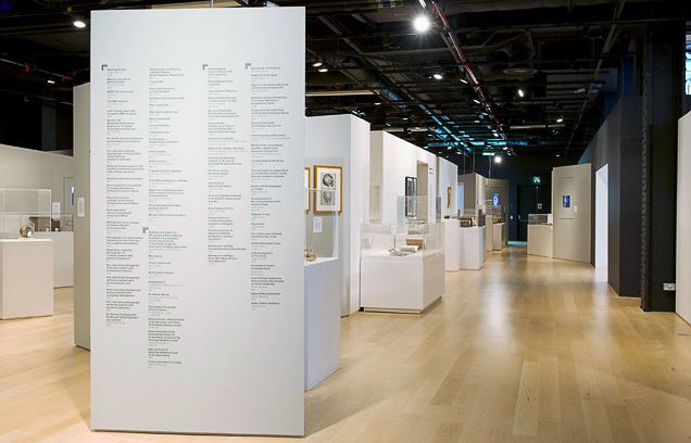
The exhibition wall texts alluded to diagrams and labels, incorporating leader lines and typographic devices to code each exhibition section while long inventory lists of the material on display were positioned at the end of each wall.
I am in love with books so am pleased to have written several on graphic design related subjects and be co-founder of the publishing house GraphicDesign&. My favourite book as author is probably my first, The Designer and the Grid in which I indulged an ongoing obsession with abstraction, structure and systems both in terms of the book’s layout and its content.
Here are some spreads from Good: An Introduction to Ethics in Graphic Design. Wow, never have I thought so hard! The book looks at how ethics and graphic design relate by drawing on philosophy, religion, politics and the law. When I started I thought of myself as quite socially aware but finished having had many of my preconceptions challenged.
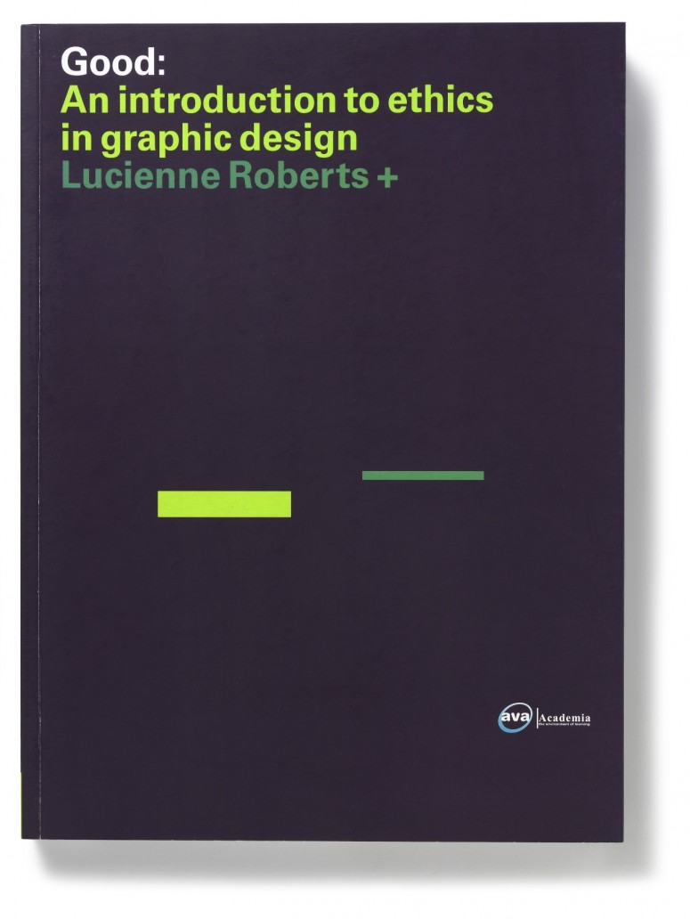
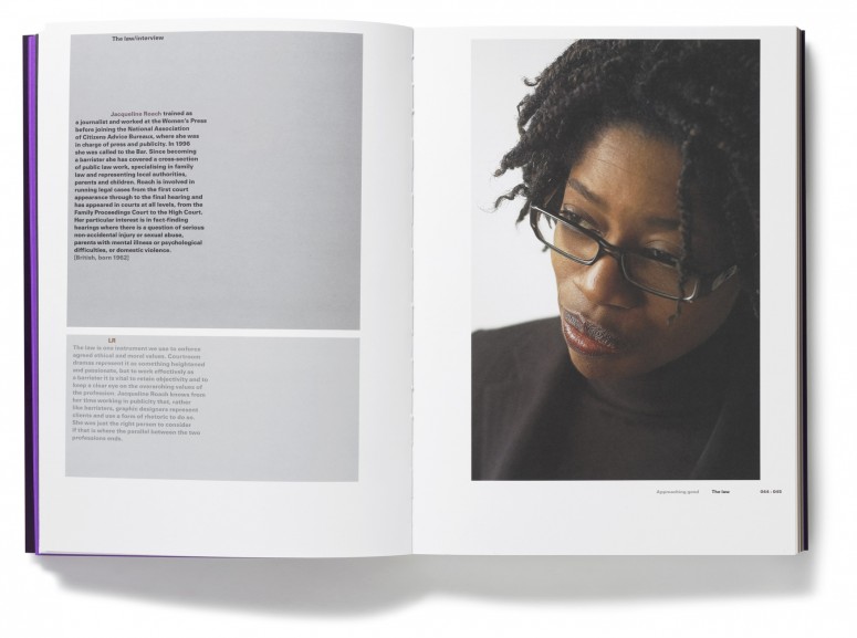
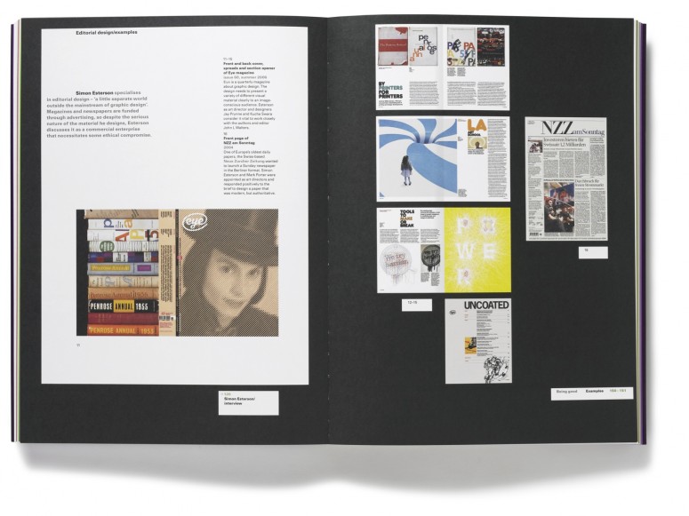
Lastly I have to show Page 1: Great Expectations, published this year by GraphicDesign&.
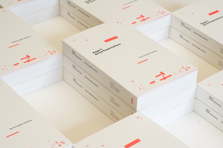
Co-founded by myself and design educator Rebecca Wright, GraphicDesign& is a pioneering publishing house dedicated to creating intelligent, vivid books that explore how graphic design connects with all other things and the value that it brings. Designed to appeal to non-graphic designers and designers alike, our books draw on the expertise of people in all fields to demonstrate that graphic design is fundamental to how society operates. Page 1: Great Expectations is a GraphicDesign& Literature title. It’s an unusual typographic experiment that explores the relationship between graphic design and the reading of a page by showing 70 responses to the same brief – to design and lay out the first page of Great Expectations by Charles Dickens. Shown here are the pages by A Practice for Everyday Life, Experimental Jetset, and Neil Donnelly.
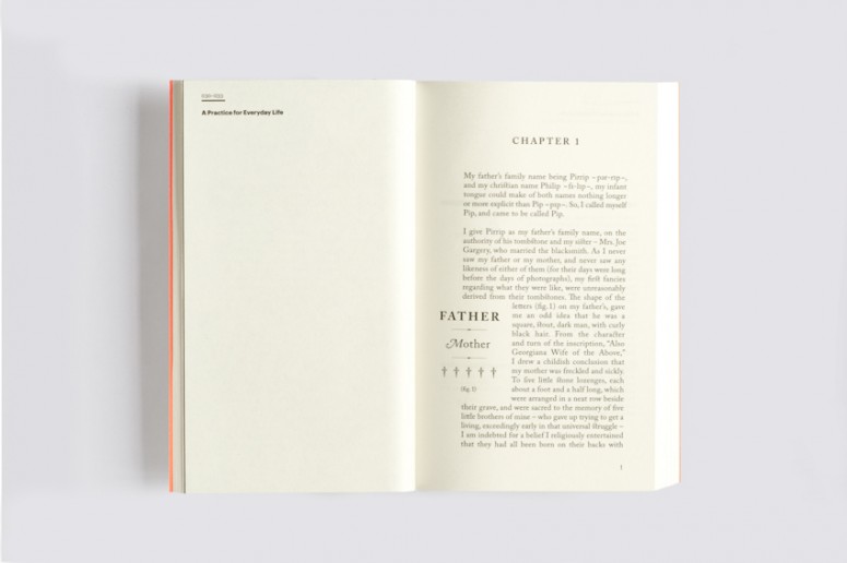
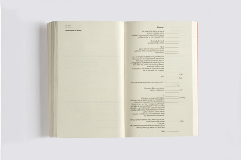
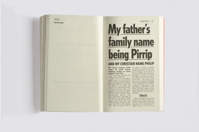
See more here, or buy one of the few copies we have left!
2. The theme of this year’s TYPO London is »Social«. Do you consider design to be a social discipline? Which design project do you consider to be particularly socially relevant?
As a typographer and graphic designer I’d say ‘yes’, unequivocally. It is obviously a social activity because it requires input from others… clients, fellow designers, copywriters, image-makers, printers, coders to name but a few. I guess it’s the end-users that make it a social act though. Ever since the invention of printing, graphic design has had a role in how we inform, educate, entertain and provoke and – unlike many other areas of the visual arts – is now seen and used by everyone. Arriving at agreement about what gives graphic design social value however, is so difficult that even after 25 years of thinking and writing about it I’m easily put off my stride. That said I signed First Things First 2000, which gives a pretty big clue as to where my allegiances lie.
3. A conference like TYPO London is in itself an obvious example for a social event: what are you especially looking forward to?
My talk being over – so I can listen to all those talented speakers and chat to audience members without fear! I know I will learn a lot…
4. Required reading/watching: What are currently your favorite interesting/beautiful publications, exhibitions, books, movies and/or websites?
I wouldn’t say any of this is ‘required’ as my choices are far too idiosyncratic for that!
A recent book purchase is the Taschen facsimile of Oliver Byrne’s 1847 edition of The Elements of Euclid, an engrossing example of design and print bringing information to life. I bought it on the recommendation of mathematician Alex Bellos, who is working with Rebecca and I on one of the next GraphicDesign& titles. Despite being Victorian this version of Euclid looks more like something produced by the Constructivists with every figure and diagram employing the primaries and black. It really is ahead of its time.
Watching wise I’m going to urge people to engage with the US election coverage, not least because I have been asked to contribute to an incredibly ambitious ‘rebrand the USA’ project soon to feature on the SFMOMA blog. It’s the brainchild of Eric Heiman, principal and co-founder of design agency Volume Inc. He writes: The American identity as a whole … remains stubbornly retrograde … an impending presidential election seems as ripe an opportunity as any to challenge long held American notions and grapple with the issues and contradictions inherent in the exercise of nation branding. Read more here and watch this space!
If it weren’t for TYPO London I’d hot-foot it to the Barbican on October 20 to attend the first day of the Battle of Ideas weekend. With sessions that include ‘Who needs art anyway?’ and ‘High and low culture: separated at birth?’ this event is right up my street. Appropriately Sunday’s offerings include ‘Atheism: what’s the point?’ so this, coupled with a visit to the Rain Room in the Barbican Curve will round off the weekend pretty well. Random International’s installation is a 100 square metre field of falling water that is sensitive to visitors in the space. Given that I am known to be a bit of a control freak the idea of controlling the rain has some appeal!


