Their clients include the Architects’ Journal, British Council, Phillips de Pury, Tate Modern & Britain, Victoria & Albert Museum and Wellcome Trust and they are an increasingly sought after partner for collaborations with architects, curators, creative directors and photographers.
: Brand Identity, Signage and Printed material
→ The Hepworth Wakefield (2010)
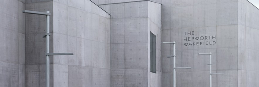
Starting from the facade lettering down to cellotape, A Practice for Everyday Life directed the museum‘s corporate identity towards a contemporary look resembling David Chipperfield Architect’s minimalist approach. The Hepworth Wakefield is the UK’s largest purpose-built museum outside of London. Situated in the birthplace of sculptor Barbara Hepworth, it exhibits her work alongside that of other British modernists and contemporary artists.
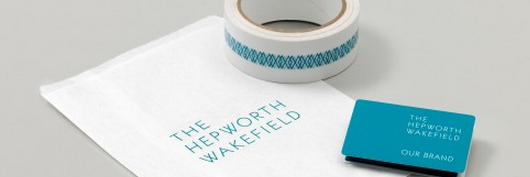
Bags, envelopes and matches were shaped and coloured according to developed CI quidelines and the custom typeface family. The identity as well as the typeface were to echo the angular shapes from the gallery building, colours inspired by the oxidised copper found in Hepworth’s work, and the textures and patterns of her sculptures.
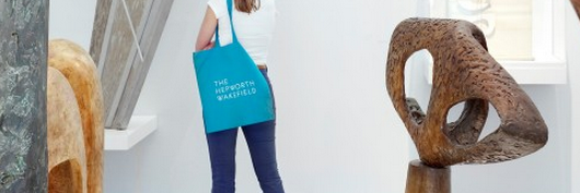
Contrasting the minimalist approach of shape and colour of the buiding, A Practice of Everyday Life choose a vivid turquoise for accessories. The gallery signage compliments David Chipperfield Architect’s minimalist building, and a series of printed materials bring the gallery’s events and exhibitions to a new audience.

In collaboration with Emma Williams the museum received a custom font family with sex weights. The Hepworth Wakefield font family was shown in this year‘s Brno Biennial exhibition and A Practice for Everyday Life as well as the all other companies having partnered up for the Hepworth Wakefield project were recently accoladed with the RIBA award 2012.
: : :
: Exhibition Graphics, Victoria & Albert Museum
→ Postmodernism, Style & Subversion 1970–1990 (2012)
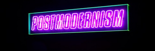
Evolving from the ideas of Modernism of the early 19th century, Postmodernism encompasses a wide range of practices from graphic design to philosophy, and everything in-between. It was a radical reaction to simplicity, always resisting a straightforward explanation. For the Victoria & Albert exhibition A Practice for Everyday Life wanted to reflect on this extensive variety without directly pastiching previous works. Utilising supergraphic reproductions as towering billboards on the walls.
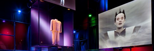
Neon lighting evocative of the reoccurring vision architects held for future city landscapes. And a labeling system held in place with patterned elastic bands of Memphis reproductions placed on top of bright coloured perspex, which varied between each of the 3 rooms.
: : :
: Book Design, Visual Editions
→ The Life and Options of Tristram Shandy, Gentlemen, (2010)
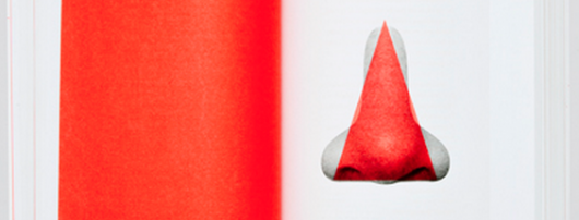
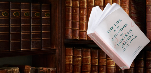
In 2010 a Practice for Everyday Life designed a new edition of The Life and Options of Tristram Shandy, Gentlemen, for Visual Editions. The volume is currently on display in the two-part Love British Books exhibition celebrating British books.

Kirsty Carter & Emma Thomas (A Practice For Everyday Life)
Entering a visual dialogue with the spectator: the works of London-based A Practice for Everyday Life draw international attention. Recent projects include the exhibition design and publication of “Bauhaus: Art as Life“ at Barbican Art Gallery and a new visual identity for Witte de With Center for Contemporary Art in Rotterdam. Working on everything from brand identity, print to signage, wayfinding and exhibition design, Kirsty Carter and Emma Thomas enjoy investigating, exploring, collecting and experimenting to arrive at outcomes that surprise, delight and engage on many levels.
Currently they are working on the graphic identity of a new cross-disciplinary arts space in Hong Kong and the design of a major new retrospective publication for the artist Linder. At TYPO London Kirsty and Emma will show us how their communication skills create settings that one feels inescapably drawn into. (Photo: Carol Sachs)


