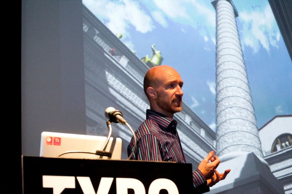
After viewing a ridiculous number of thumbnails (16,089 to be exact) here’s what he found. Warning: this was not a scientific study.
Trajan was released in 1990. This meant he needed to filter through over 20 years of movie posters. This also meant he needed to set a few ground rules
- Trajan was used for the original poster
- Trajan has to be the main typeface
- Each film only counts once
What he found?
There are over 400 movie posters in 20 years that use Trajan. Yves once again noticed a few trends.
- If a popular film uses Trajan on year, the use of Trajan explodes in the next year.
- In 1999 Adobe expanded the typeface. The use of Trajan in movie posters went up.
- In 2005 Trajan was bundled into a few programs. Again an explosion.
Recently, Trajan was expanded to more weights and a sans version. Yves estimates again we will see a boost in Trajan
So here’s the breakdown.
Trajan has defied genre and is being used in drama, romantic comedies and horror files. Brilliantly enough, the Oscars even decided to adopt Trajan.
However, in 2006 Gotham starting to popping up in posters – really popular ones. And in an even more brilliant move than before, the Oscars jumped on the bandwagon used Gotham as their primary font in marketing materials last year.

Yves Peters
Graphic Designer, Rock Drummer (Ghent, Belgium)
—
Yves edits The FontFeed, a daily dispatch of recommended fonts, typography techniques, and inspirational examples of digital type at work in the real world; and Unzipped, his blog on the FontShop BeNeLux home page. He also is an accomplished drummer with British/American/Belgian pop/rock bands Troubleman and Rosa Luxe*. Yves’ talent for being able to identify most typefaces on sight is utterly useless in daily life.
— posted by Brooke Francesi


Pingback: TYPO San Francisco » Blog Archiv » Yves Peters: Trajan in Movie … « Blog movie
Pingback: The Art of Typography